Bayesian inference for multinomial data from small areas incorporating uncertainty about order restriction
Section 4. Application to body mass index data
4.1 Body mass index
The performance of our
method is studied using the Third National Health and Nutrition Examination
Survey, NHANES III. NHANES III is a stratified multistage probability design
targeted to obtain a representative sample of the total civilian
noninstitutionalized U.S. population age 2 months and older. The sample was
selected from households across the United States during the period October
1988 through September 1994. Some individuals area selected with different
probabilities. For confidentiality reasons, the final data set for this study
uses only the 35 largest counties (from 14 states) with a population of at
least 500,000 for selected age categories by sex (male, female) and race (white
non-Hispanic, black non-Hispanic, Hispanic, other).
The original sensitive
attributes BMI data are transformed to categorical data based on the criteria
defined by the Centers for Disease Control (CDC), which are underweight,
normal, overweight, obese I, and obese II. If BMI is less than 18.5, it falls
within the underweight range. If BMI is 18.5 to
25, it falls within the normal. If BMI is 25.0 to
30, it falls within the overweight range. If BMI is
30.0 to
35, it falls within the obese I range. If BMI is 35.0
or higher, it falls within the obese II range. Our goal is to estimate the
proportions of the BMI levels. Table 4.1 gives an illustration of the
female BMI data of a few counties, where it can be seen that the cell
probability is largest for the normal range and other probabilities roughly
tail off on both sides to form the unimodal order restriction. Indeed, there are
violations in some counties in the earliest and latest cells.
Thus, for each county,
the BMI counts can be assumed to follow a multinomial distribution because each
individual person can be assumed to exist independently. Figure 4.1 shows
a histogram of all BMI values for females aggregated into a single large
sample. It can be clearly seen that the unimodal order restriction holds.
Because the data in the individual counties are generally sparse, it is
difficult to tell whether the unimodal order restriction holds. However, it is
sensible to assume that the same unimodal restriction holds within all the
counties. Therefore, we can use multinomial distributions to model the female
BMI counts.
Table 4.1
The female BMI in five levels
Table summary
This table displays the results of The female BMI in five levels. The information is grouped by County ID (appearing as row headers), BMI_lvl1, BMI_lvl2, BMI_lvl3, BMI_lvl4 and BMI_lvl5 (appearing as column headers).
| County ID |
BMI_lvl1 |
BMI_lvl2 |
BMI_lvl3 |
BMI_lvl4 |
BMI_lvl5 |
| 1 |
3 |
40 |
37 |
13 |
4 |
| 2 |
1 |
36 |
38 |
15 |
1 |
| 3 |
3 |
20 |
49 |
13 |
5 |
|
|
|
|
|
|
|
| 35 |
1 |
41 |
41 |
9 |
0 |
| Total |
45 |
1,201 |
1,318 |
496 |
89 |
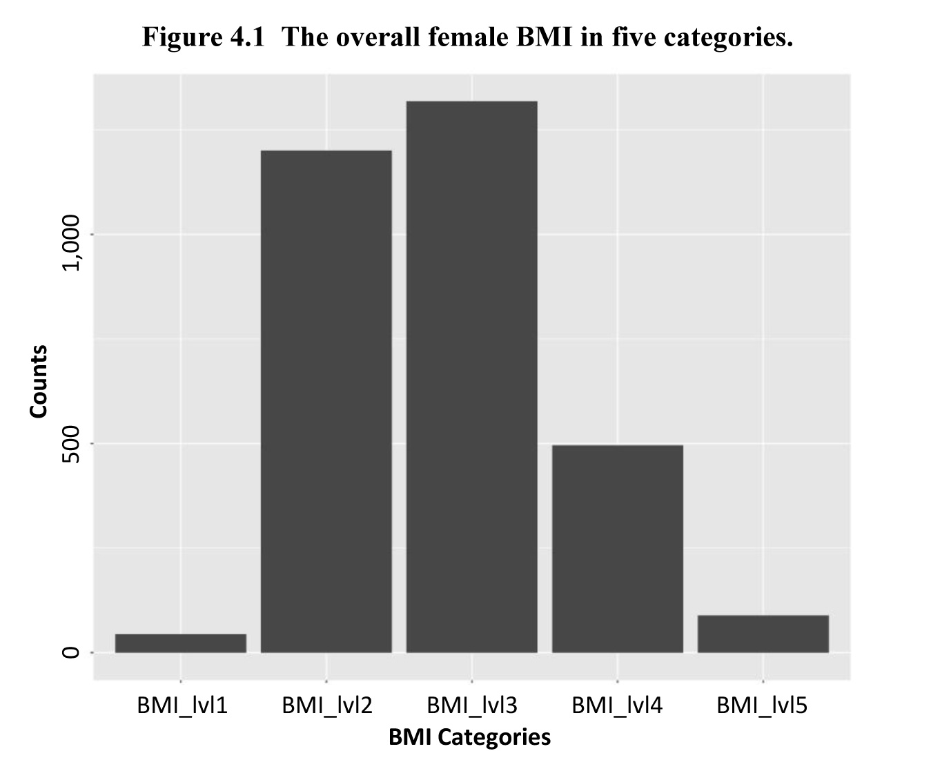
Description of Figure 4.1
Figure presenting a histogram of the five BMI groups for females aggregated into a single large sample. There are 45 females BMI group 1, 1,201 females BMI group 2, 1,318 females BMI group 3, 496 females BMI group 4 and 89 females BMI group 5.
4.2 Fitting
and
4.2.1 MCMC convergence
For each model, we run
20,000 MCMC iterations, take 10,000 as a “burn in” and use every
to obtain 1,000
converged posterior samples to maintain consistency. Table 4.2 gives the
effective sample sizes of the parameters
for the model
with the order restriction and the general model. The effective sample sizes
are almost 1,000. Table 4.3 provides p-values of the Geweke test to check
the convergence of the parameters (Geweke, 1991). All p-values are large enough
to not reject the null hypothesis that the MCMC is stationary. Then posterior
samples can be used for the further inference.
Table 4.2
Effective sample sizes of
and
Table summary
This table displays the results of Effective sample sizes of (équation) and (équation) (équation) (appearing as column headers).
|
|
|
|
|
|
|
|
|
1,000 |
1,123.7 |
1,000 |
1,000 |
895.4 |
1,000 |
|
(Mode at 2nd) |
1,000 |
1,000 |
1,000 |
1,000 |
1,150.2 |
1,000 |
|
(Mode at 3rd) |
1,000 |
887 |
889 |
1,000 |
1,173.9 |
1,000 |
Table 4.3
P values of Geweke test for
and
Table summary
This table displays the results of P values of Geweke test for (équation) and (équation) (équation) (appearing as column headers).
|
|
|
|
|
|
|
|
|
0.623 |
0.558 |
0.899 |
0.767 |
0.959 |
0.514 |
|
(Mode at 2nd) |
0.964 |
0.705 |
0.507 |
0.511 |
0.837 |
0.999 |
|
(Mode at 3rd) |
0.817 |
0.559 |
0.580 |
0.557 |
0.812 |
0.516 |
4.2.2 Model comparison
With the approximate
mixture probabilities, we mix posterior samples of
and
together to
construct samples of
We provide posterior mean
(PM), posterior standard deviation (PSD) and coefficient of variation (CV) of
for all
counties, which can be found in Appendix A.4.
To compare model difference
visually, we present the posterior densities plots about different counties in
those models as Figure 4.2, Figure 4.3, Figure 4.4 and Figure 4.5.
We use different colors to indicate five BMI levels and dashed lines for the
posterior means. Due to different capability of borrowing information among areas,
we can see different flatness of posterior density curves in the models. With
different order restriction assumptions, those posterior density curves center
at different places and may overlap differently. We mainly focus on density
curves of normal BMI and overweight BMI, since the modal position might be
second or third.
In Figure 4.2 has
posterior density plots for County 2 applying different models. The number of
observations with normal BMI level, which is 36, is close to the number of
observations with overweight BMI level, which is 38. The unimodal order
restriction may not hold in County 2. Maybe for this reason, there is a
significant overlap between normal level and overweight level in the first plot
after applying
to our BMI
data. The second plot and the third plot show much less overlap in density
curves, due to the strong order restriction assumption. The last plot, which is
the density curve from
, is similar to the density curves in
Based on the
observations in County 2, the order restriction that the modal position is at
the third may be reasonable. The density curves in
and
may be
appropriate for County 2.
In Figure 4.3 has
posterior density plots for County 3 applying different models. Unlike in
County 2, the density curves of
from model
in County 3
shows a very strong unimodality because we have 49 people in overweight BMI
level which dominates this county. The second plot from
which assumes
that the mode is at normal BMI level, has a significant overlap. Its order
restriction assumption that the modal position is at the second position may
not hold in this county. The third plot from
which assumes
that the mode is at overweight BMI level, is similar as the density curve in
The posterior
mean of normal BMI level probability is higher than in
This phenomenon
can be considered as an evidence that
has a stronger
borrowing ability than
Overall, the
modal position among 35 counties may be at the third.
can borrow more
information among those counties than other models. Then the last plot, which
is the density curve from
has a little overlap.
But the unimodal pattern is still in
In Figure 4.4, they
are posterior density plots for County 13 applying different models. Only
with an
assumption that the mode is at normal BMI level does not show a significant
overlap. Since more people are at overweight BMI level, that assumption may be
validate in County 13.
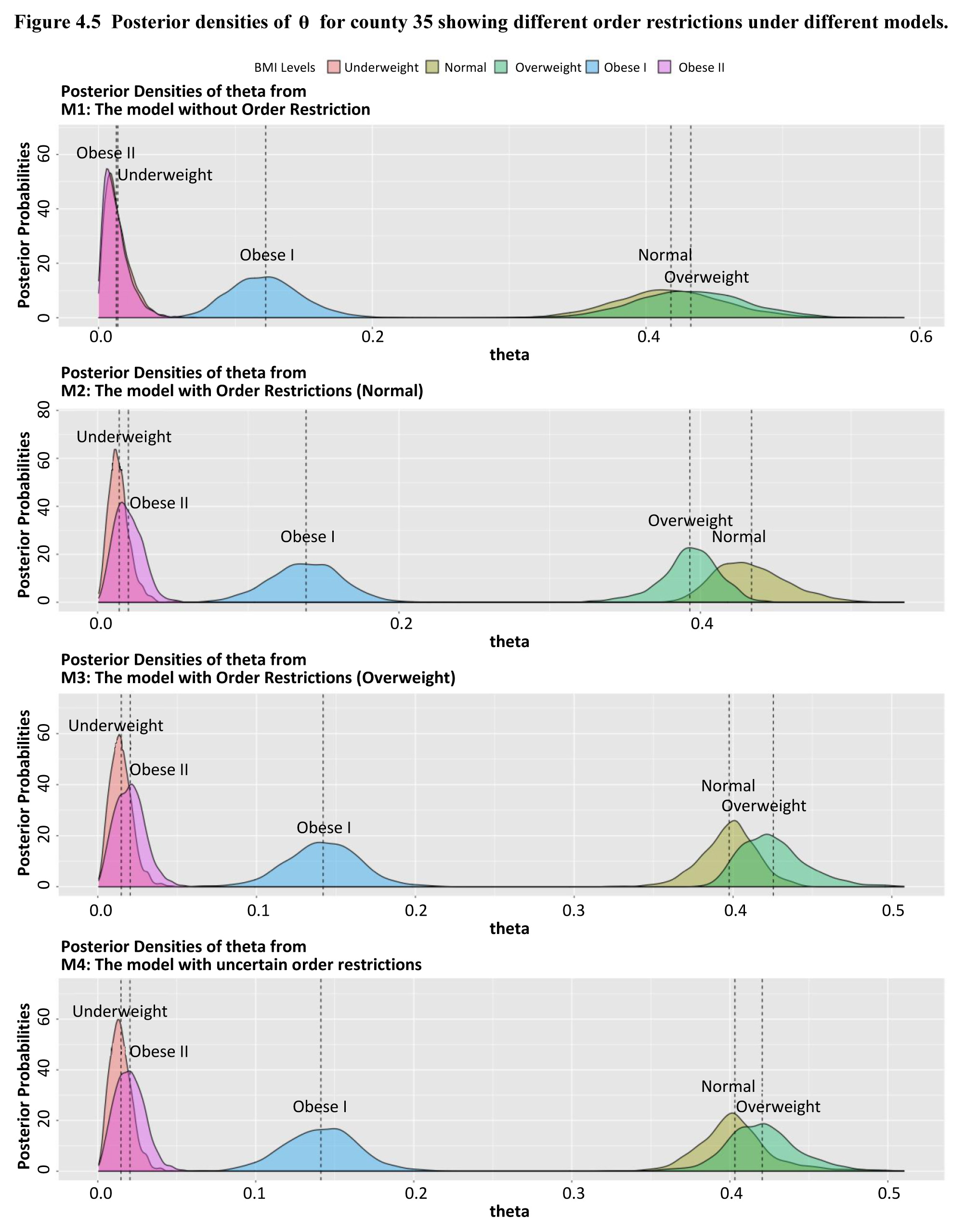
Figure 4.5 provides
posterior density plots for County 35, which has almost same amount of people
in normal and overweight BMI level.
and
with different
unimodal assumptions have opposite conclusion about normal and overweight
probabilities. In this county,
and
may be better
models.
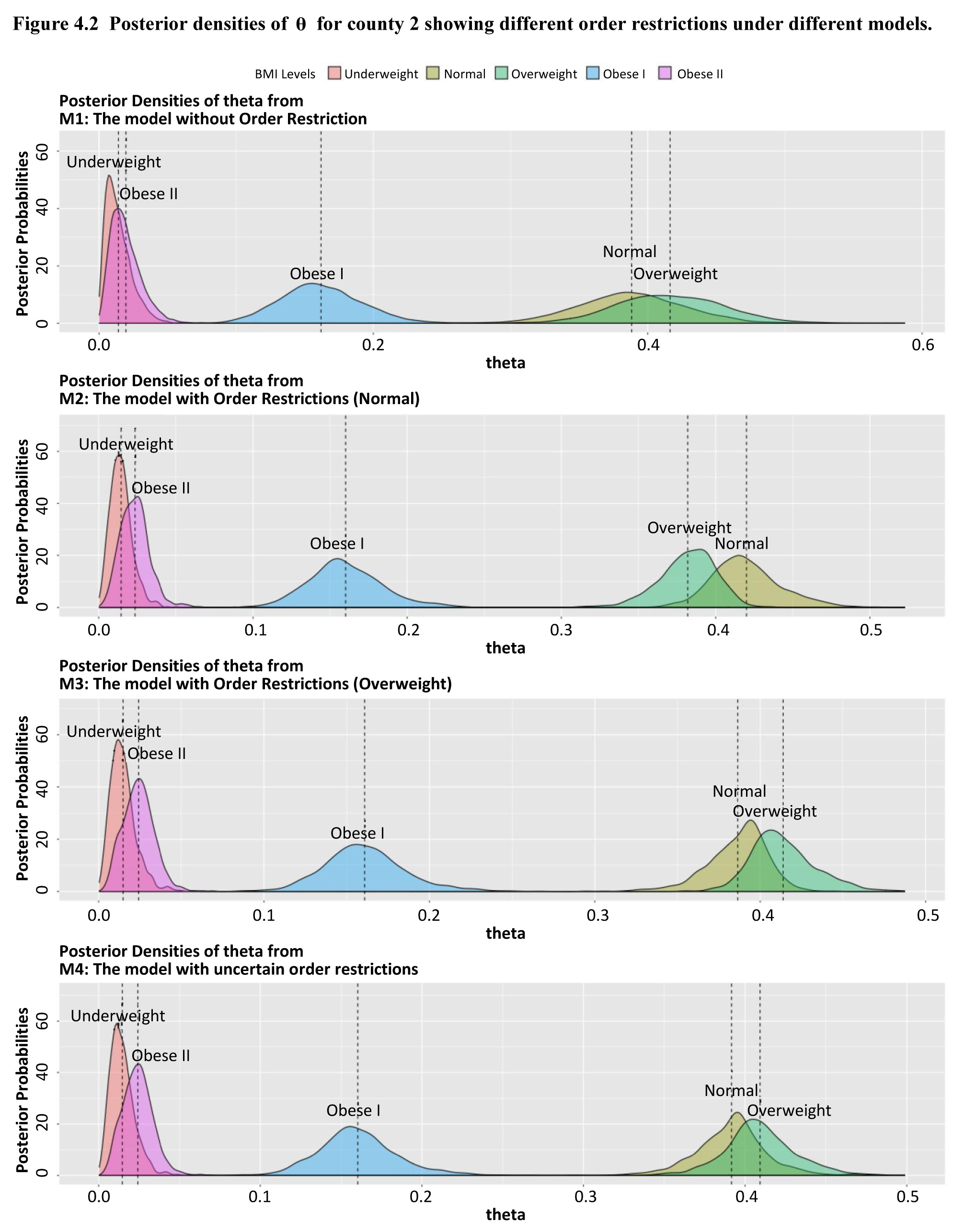
Description of Figure 4.2
Figure presenting posterior density plots of θ for County 2 showing different order restrictions under different models. The first graph represents the model without Order Restriction, noted M1. The second graph represents the model with Order Restrictions with normal weight, noted M2. The third graph represents the model with Order Restrictions with overweight, noted M3. The fourth graph represents the model with uncertain order restrictions, noted M4. In each of these graphs, we find the five BMI levels: Underweight, Normal, Overweight, Obese I and Obese II. The vertical dashed lines represent the posterior means.
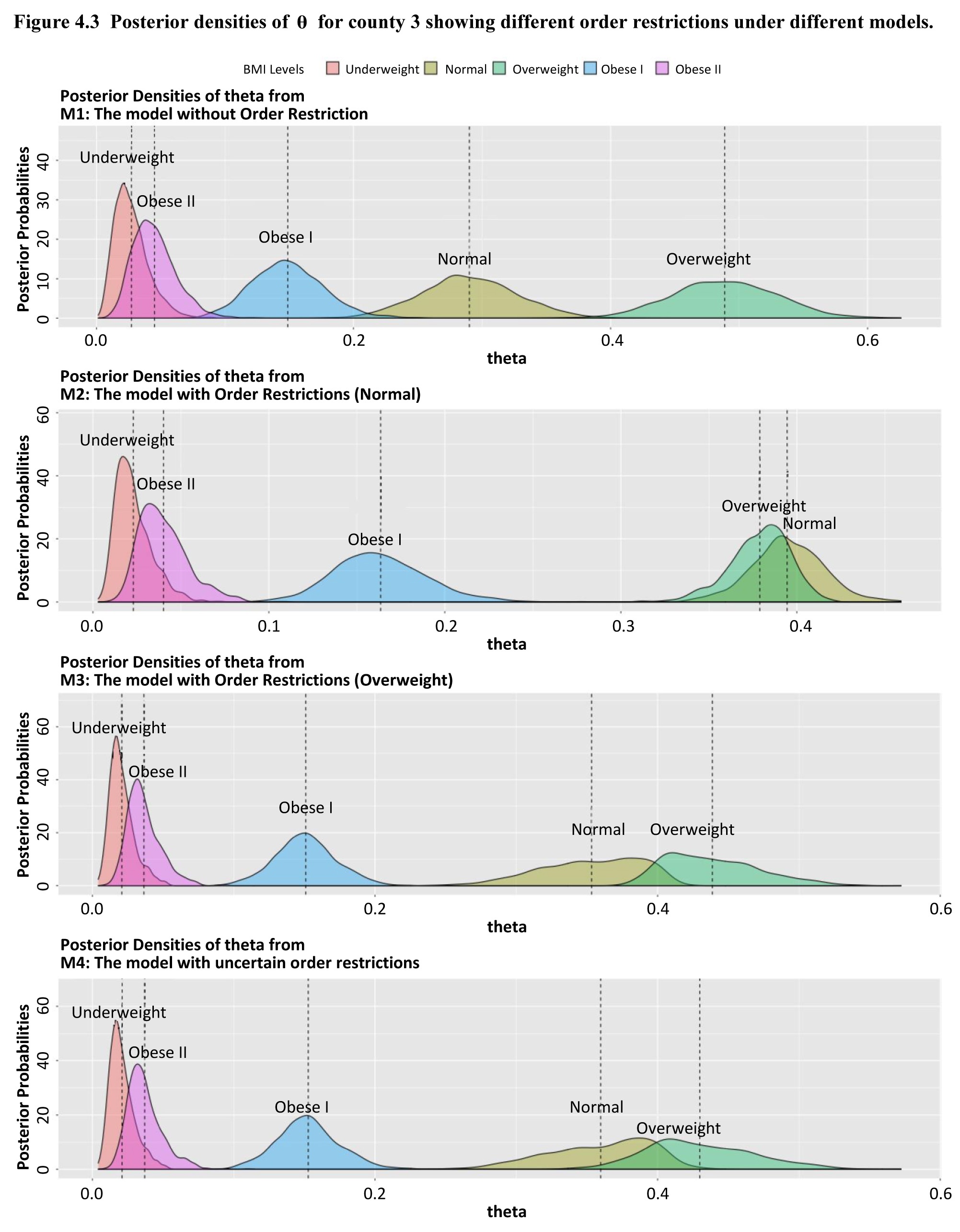
Description of Figure 4.3
Figure presenting posterior density plots of θ for County 3 showing different order restrictions under different models. The first graph represents the model without Order Restriction, noted M1. The second graph represents the model with Order Restrictions with normal weight, noted M2. The third graph represents the model with Order Restrictions with overweight, noted M3. The fourth graph represents the model with uncertain order restrictions, noted M4. In each of these graphs, we find the five BMI levels: Underweight, Normal, Overweight, Obese I and Obese II. The vertical dashed lines represent the posterior means.
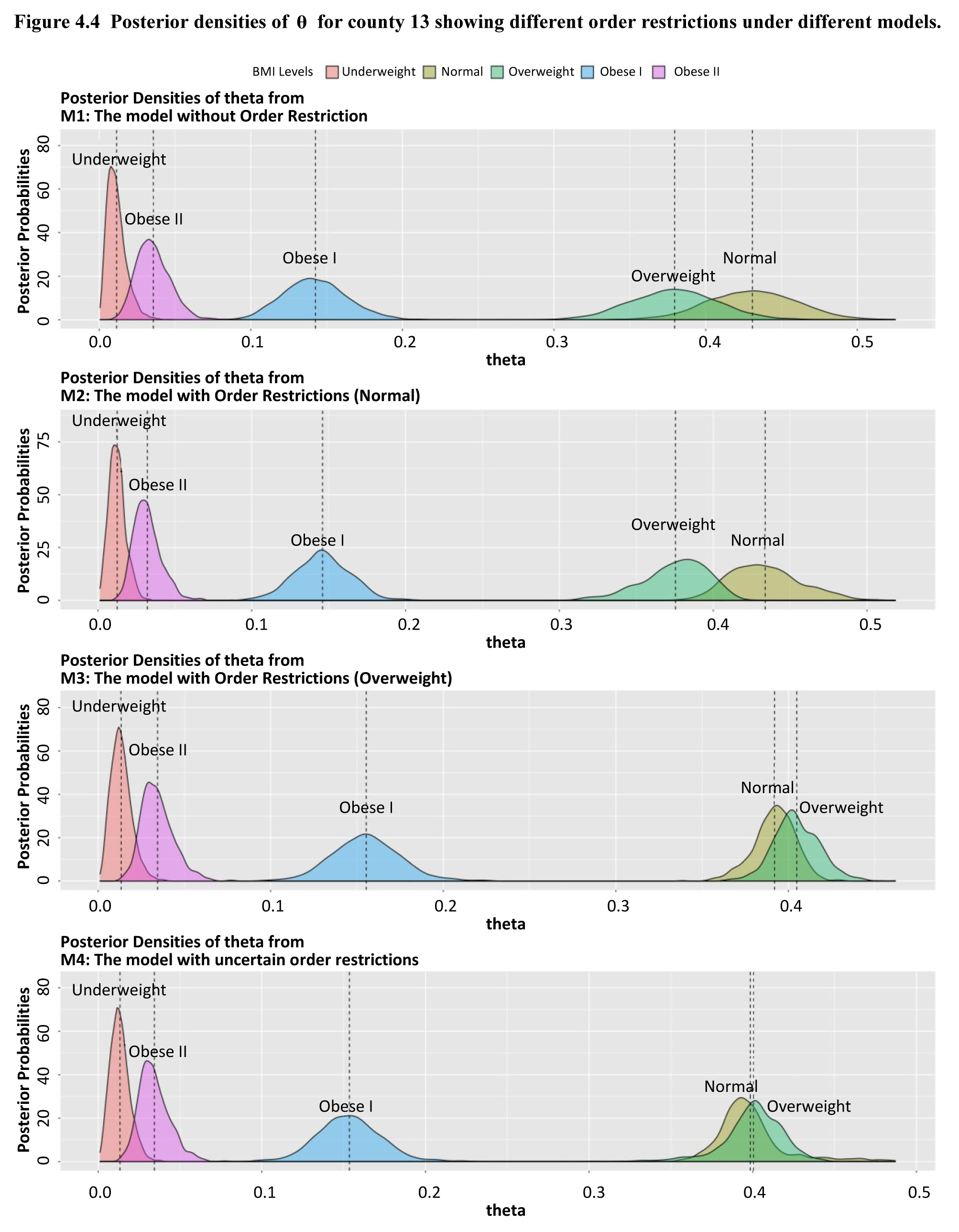
Description of Figure 4.4
Figure presenting posterior density plots of θ for County 13 showing different order restrictions under different models. The first graph represents the model without Order Restriction, noted M1. The second graph represents the model with Order Restrictions with normal weight, noted M2. The third graph represents the model with Order Restrictions with overweight, noted M3. The fourth graph represents the model with uncertain order restrictions, noted M4. In each of these graphs, we find the five BMI levels: Underweight, Normal, Overweight, Obese I and Obese II. The vertical dashed lines represent the posterior means.
Description of Figure 4.5
Figure presenting posterior density plots of θ for County 35 showing different order restrictions under different models. The first graph represents the model without Order Restriction, noted M1. The second graph represents the model with Order Restrictions with normal weight, noted M2. The third graph represents the model with Order Restrictions with overweight, noted M3. The fourth graph represents the model with uncertain order restrictions, noted M4. In each of these graphs, we find the five BMI levels: Underweight, Normal, Overweight, Obese I and Obese II. The vertical dashed lines represent the posterior means.
Overall, the model with
order restrictions,
and
can borrow more
information among areas than the model without order restriction,
The model with
uncertain order restriction,
borrow less
information among areas than
or
For this
reason,
and
have sharper
posterior density curves than
has slightly
flatter posterior density curves than
and
For the same
reason, as shown in Table 4.4,
has the largest
total variance, which is the sum of posterior variance of all counties’ cell
probabilities.
and
have the
smallest variance due to its strong unimodal order restriction assumption.
variance is
between
and
(or
since
is a mixture of
and
Table 4.4
Total variance of
Table summary
This table displays the results of Total variance of (équation). The information is grouped by (équation) (appearing as row headers), (équation) (mode at normal), (équation) (mode at overweight) and (équation) (appearing as column headers).
|
|
(mode at normal) |
(mode at overweight) |
|
| 0.172 |
0.063 |
0.069 |
0.107 |
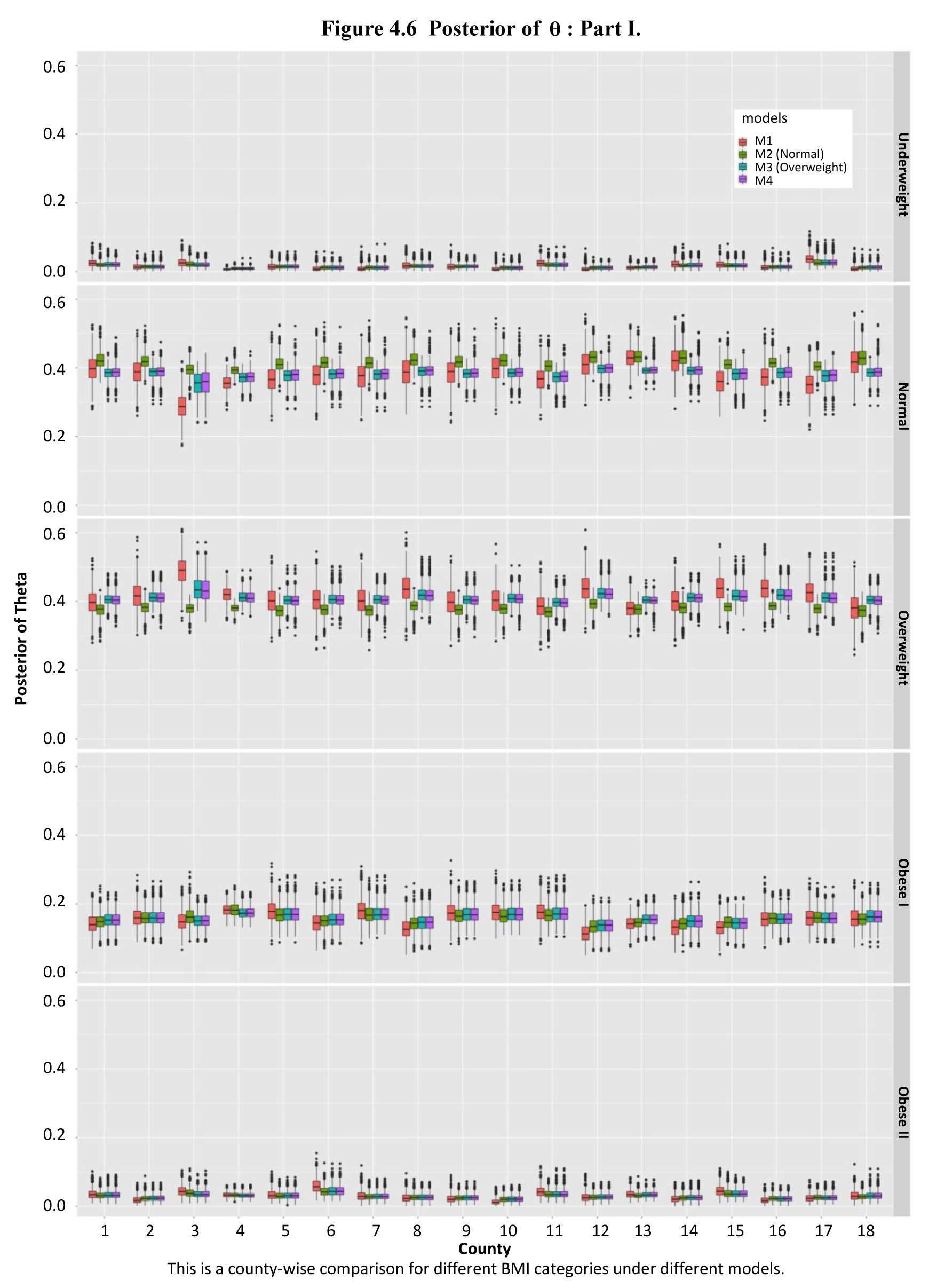
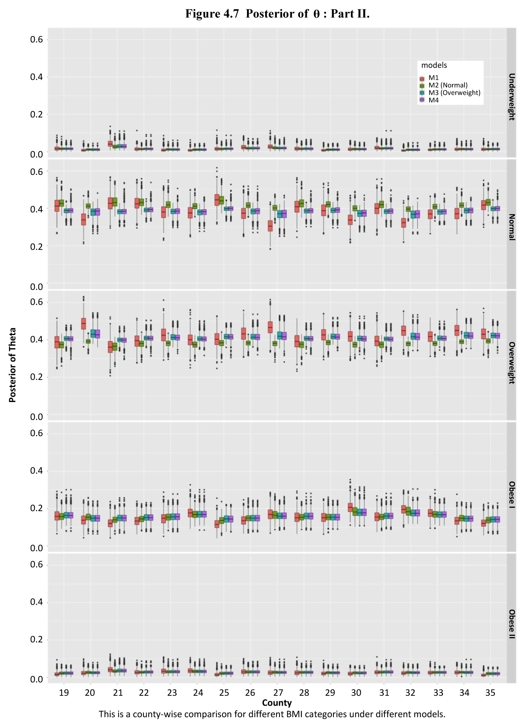
Figure 4.6 and
Figure 4.7 are boxplots of
posterior
samples. The first (Underweight) and last (Obese II) blocks show that different
models do not have much difference in estimating the cell probabilities of
underweight, normal, and obese I. In the box plots, short line segments from
and
and long line
segments from
show that the
models with order restrictions
have smaller
variances than the model without order restriction
The models with
order restrictions can borrow more information than the model without order
restriction. The differences between each box of
are larger than
the differences in
and
In other word,
the differences between posterior mean of each county in
are larger than
other models’. It proves that the models with order restrictions borrow more
information among areas than the model without order restriction.
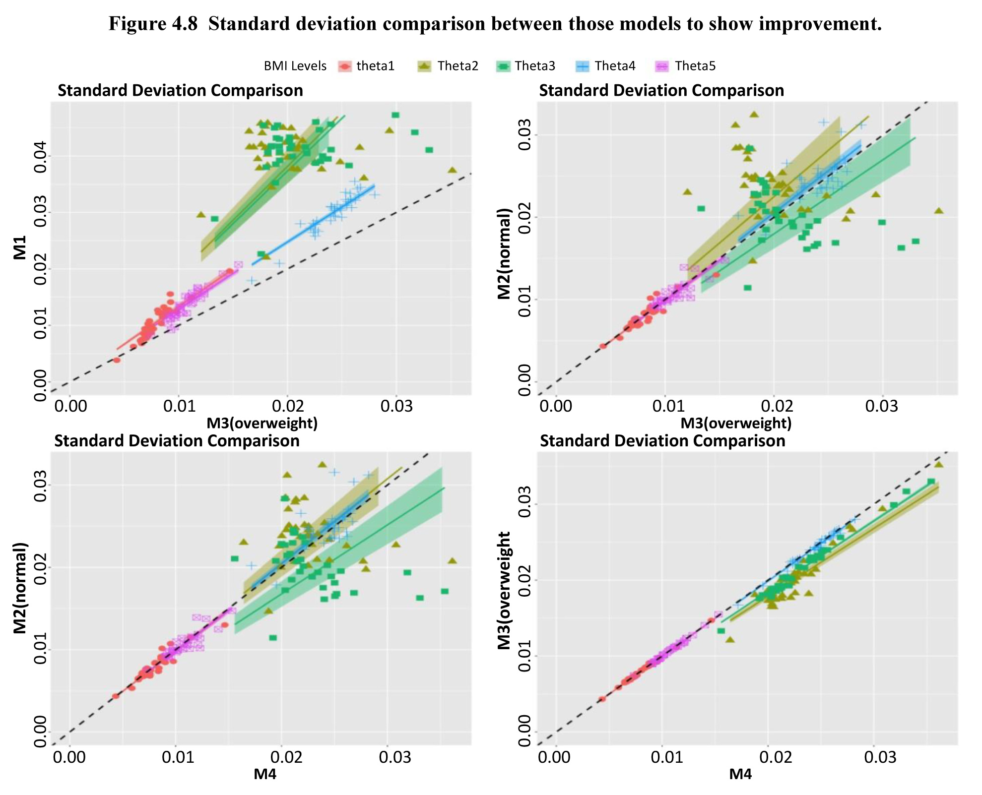
In Figure 4.8, we
have some regression lines to show the overall posterior standard deviation comparison
among those models. The black dashed line is a reference line whose slope is
one. The first plot shows a comparison between
and
(mode at
overweight). All of regression lines are above the reference line, which means
that
(mode at
overweight) has smaller standard deviation. We gain higher precision on
estimation of cell probabilities among 35 counties in
The second plot
shows a comparison between
(mode at
normal) and
(mode at
overweight). The regression lines about underweight, Obese I and Obese II are
around the reference line. Only the regression line about overweight shows
significant difference. It means
(mode at
overweight) is slightly better than
(mode at
normal). In other word, the assumption that overweight BMI probability is the
highest may be more reasonable. The last two plots in Figure 4.8 is a
comparison between
(mode at
normal) and
(mode at overweight)
and
performance is
slightly worse than
and
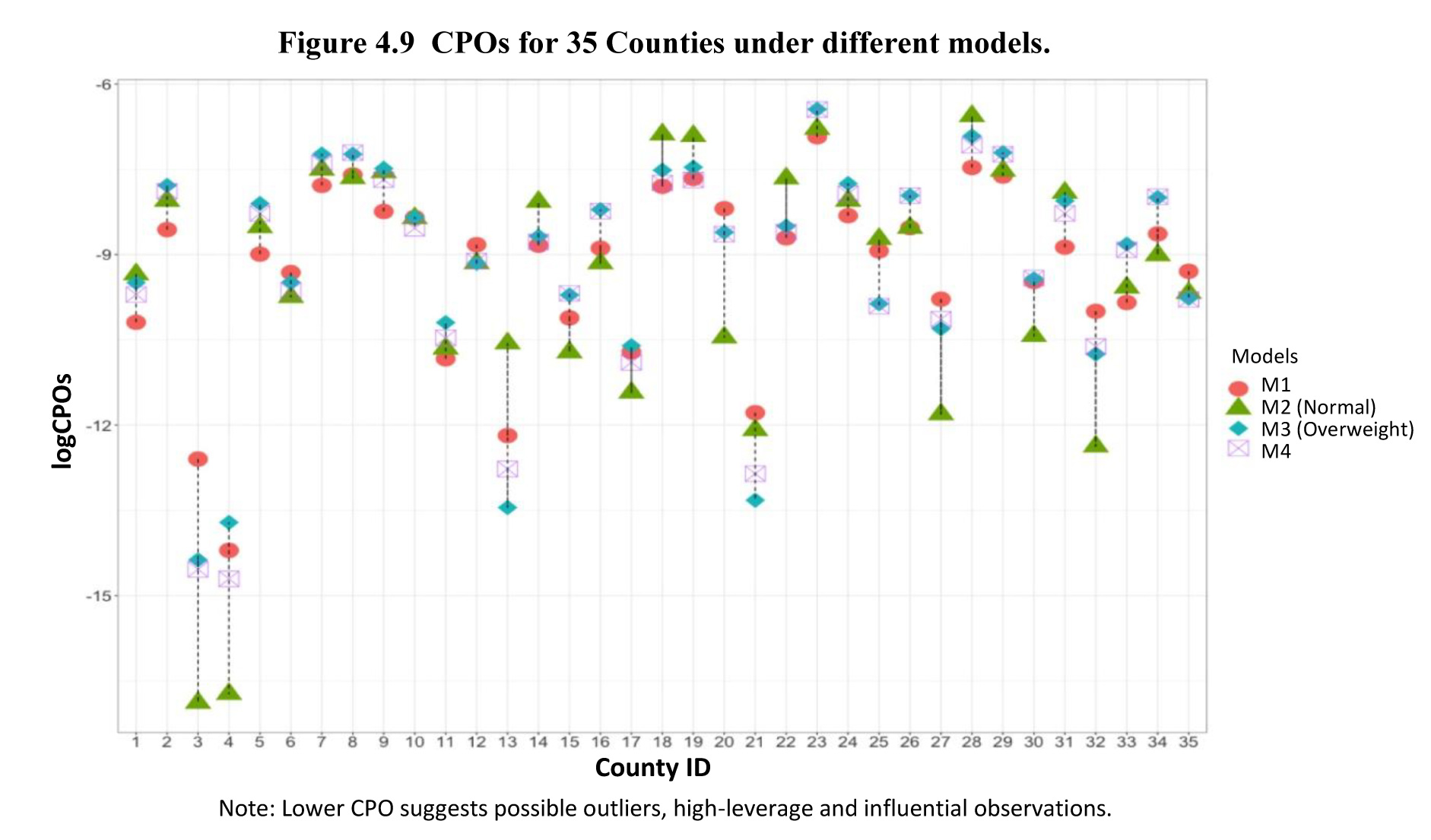
In Figure 4.9, we
use different symbols to represent different models’ CPO for all 35 counties. In
BMI data, County 4 has the largest population, which shows lowest CPO value
among others. It is known that low CPO values suggest possible outliers,
high-leverage and influential observations. Due to the borrowing feature from
the models, County 3 has a low CPO which may be affected by County 4. For most
counties, the model with order restriction which assumes the mode is at
overweight position can have large CPO, compared with other models. As a
summary, in Table 4.5,
(mode at
overweight) has the largest LMPL, which should the “best” model for
our BMI data.
Description of Figure 4.6
Figure presenting the comparison by box plots of
posterior samples for counties 1 to 18 for the 5 BMI levels (Underweight, Normal, Overweight, Obese I and Obese II) under different models (M1, M2, M3 and M4). In the box plots, short line segments from M2, M3, and M4 and long line segments from M1 show that the models with order restrictions (M2, M3 and M4) have smaller variances than the model without order restriction (M1).
Description of Figure 4.7
Figure presenting the comparison by box plots of
posterior samples for counties 19 to 35 for the 5 BMI levels (Underweight, Normal, Overweight, Obese I and Obese II) under different models (M1, M2, M3 and M4). In the box plots, short line segments from M2, M3, and M4 and long line segments from M1 show that the models with order restrictions (M2, M3 and M4) have smaller variances than the model without order restriction (M1).
Description of Figure 4.8
Figure presenting the overall posterior standard deviation comparison between those models to show improvement. The black dashed line is a reference line whose slope is one. The first plot shows a comparison between M1 and M3. All of regression lines are above the reference line, which means that M3 has smaller standard deviation. We gain higher precision on estimation of cell probabilities among 35 counties in M3. The second plot shows a comparison between M2 and M3. The regression lines about underweight, Obese I and Obese II are around the reference line. Only the regression line about overweight shows significant difference. It means M3 is slightly better than M2. In other words, the assumption that overweight BMI probability is the highest may be more reasonable. The last two plots in Figure 4.8 is a comparison between M2 and M4, and M3 and M4. M4’s performance is slightly worse than M3 and M2.
Description of Figure 4.9
Figure presenting the conditional predictive ordinates (CPOs) for the 35 counties under models M1, M2, M3 and M4. Different symbols are used to represent different models’ CPO for all 35 counties. A lower CPO suggests possible outliers, high-leverage and influential observations.
Table 4.5
LPML, comparison of the four models using LPML
Table summary
This table displays the results of LPML. The information is grouped by (équation) (appearing as row headers), (équation) (mode at normal), (équation) (mode at overweight) and (équation) (appearing as column headers).
|
|
(mode at normal) |
(mode at overweight) |
|
| -326.76 |
-331.88 |
-318.26 |
-329.58 |
ISSN : 1492-0921
Editorial policy
Survey Methodology publishes articles dealing with various aspects of statistical development relevant to a statistical agency, such as design issues in the context of practical constraints, use of different data sources and collection techniques, total survey error, survey evaluation, research in survey methodology, time series analysis, seasonal adjustment, demographic studies, data integration, estimation and data analysis methods, and general survey systems development. The emphasis is placed on the development and evaluation of specific methodologies as applied to data collection or the data themselves. All papers will be refereed. However, the authors retain full responsibility for the contents of their papers and opinions expressed are not necessarily those of the Editorial Board or of Statistics Canada.
Submission of Manuscripts
Survey Methodology is published twice a year in electronic format. Authors are invited to submit their articles in English or French in electronic form, preferably in Word to the Editor, (statcan.smj-rte.statcan@canada.ca, Statistics Canada, 150 Tunney’s Pasture Driveway, Ottawa, Ontario, Canada, K1A 0T6). For formatting instructions, please see the guidelines provided in the journal and on the web site (www.statcan.gc.ca/SurveyMethodology).
Note of appreciation
Canada owes the success of its statistical system to a long-standing partnership between Statistics Canada, the citizens of Canada, its businesses, governments and other institutions. Accurate and timely statistical information could not be produced without their continued co-operation and goodwill.
Standards of service to the public
Statistics Canada is committed to serving its clients in a prompt, reliable and courteous manner. To this end, the Agency has developed standards of service which its employees observe in serving its clients.
Copyright
Published by authority of the Minister responsible for Statistics Canada.
© His Majesty the King in Right of Canada as represented by the Minister of Industry, 2022
Use of this publication is governed by the Statistics Canada Open Licence Agreement.
Catalogue No. 12-001-X
Frequency: Semi-annual
Ottawa
