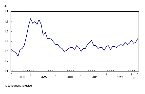
Chart 3
Inventory-to-sales ratio increases

Chart description
The title of the graph is "Inventory-to-sales ratio increases."
This is a line chart.
There are in total 61 categories in the horizontal axis. The vertical axis starts at 1.1 and ends at 1.7 with ticks every 0.1 points.
There are 1 series in this graph.
The vertical axis is "ratio1."
The units of the horizontal axis are months by year from April 2008 to April 2013.
The title of series 1 is "Inventory-to-sales ratio."
The minimum value is 1.25 occurring in July 2008.
The maximum value is 1.63 occurring in January 2009.
| ratio1 | |
|---|---|
| April 2008 | 1.32 |
| May 2008 | 1.30 |
| June 2008 | 1.29 |
| July 2008 | 1.25 |
| August 2008 | 1.32 |
| September 2008 | 1.33 |
| October 2008 | 1.36 |
| November 2008 | 1.45 |
| December 2008 | 1.56 |
| January 2009 | 1.63 |
| February 2009 | 1.58 |
| March 2009 | 1.60 |
| April 2009 | 1.57 |
| May 2009 | 1.62 |
| June 2009 | 1.57 |
| July 2009 | 1.46 |
| August 2009 | 1.49 |
| September 2009 | 1.43 |
| October 2009 | 1.43 |
| November 2009 | 1.42 |
| December 2009 | 1.39 |
| January 2010 | 1.37 |
| February 2010 | 1.37 |
| March 2010 | 1.34 |
| April 2010 | 1.33 |
| May 2010 | 1.30 |
| June 2010 | 1.31 |
| July 2010 | 1.33 |
| August 2010 | 1.34 |
| September 2010 | 1.34 |
| October 2010 | 1.32 |
| November 2010 | 1.36 |
| December 2010 | 1.34 |
| January 2011 | 1.30 |
| February 2011 | 1.33 |
| March 2011 | 1.33 |
| April 2011 | 1.37 |
| May 2011 | 1.39 |
| June 2011 | 1.41 |
| July 2011 | 1.36 |
| August 2011 | 1.36 |
| September 2011 | 1.33 |
| October 2011 | 1.34 |
| November 2011 | 1.34 |
| December 2011 | 1.31 |
| January 2012 | 1.35 |
| February 2012 | 1.36 |
| March 2012 | 1.32 |
| April 2012 | 1.35 |
| May 2012 | 1.35 |
| June 2012 | 1.34 |
| July 2012 | 1.36 |
| August 2012 | 1.37 |
| September 2012 | 1.36 |
| October 2012 | 1.39 |
| November 2012 | 1.37 |
| December 2012 | 1.38 |
| January 2013 | 1.41 |
| February 2013 | 1.38 |
| March 2013 | 1.39 |
| April 2013 | 1.43 |
Seasonally adjusted.
- Date modified: