
Report on Energy Supply and Demand in Canada
Canadian Energy Flow Diagram

Archived Content
Information identified as archived is provided for reference, research or recordkeeping purposes. It is not subject to the Government of Canada Web Standards and has not been altered or updated since it was archived. Please "contact us" to request a format other than those available.
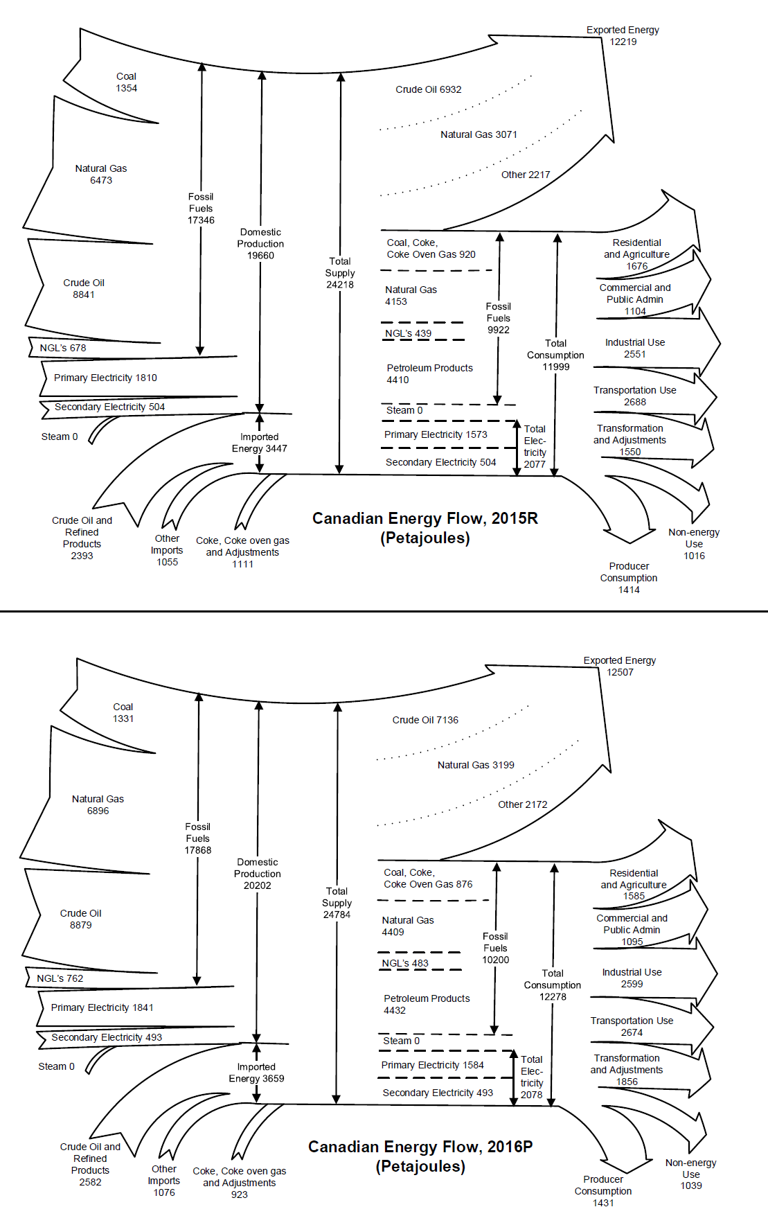
Description for figure 1: Canadian Energy Flow Diagram
The energy flow diagram is a pictorial representation of how energy moves within Canada. On the left hand side of the diagram, the supply coming from (domestic production) and into (imports) Canada is separated into major energy forms (e.g. natural gas and crude oil). Moving through the middle of the diagram to the right hand side, we can see that the total supply is then divided into how that energy is accounted for, either through exports or as consumption within Canada. The Canadian consumption is depicted first by energy types and then further into economic sectors consuming that energy. As a whole, the supply side data (left hand side) and the demand side data (right hand side), should balance.
- Date modified: