
Economic Insights
Earnings Inequality and the Gender Pay Gap in Canada: The Role
of Women’s Under-representation Among Top Earners

Archived Content
Information identified as archived is provided for reference, research or recordkeeping purposes. It is not subject to the Government of Canada Web Standards and has not been altered or updated since it was archived. Please "contact us" to request a format other than those available.
by Aneta Bonikowska, Social Analysis and Modelling Division, Statistics Canada,
Marie Drolet, Labour Statistics Division, Statistics Canada,
Nicole M. Fortin, Vancouver School of Economics, University of British Columbia
This Economic Insights article examines the representation of women in top earnings groups—specifically, the top 0.1%, next 0.9% and next 9% of earners—and the extent to which their under-representation in these groups contributes to the overall gender gap in annual earnings. Trends are documented over almost forty years from 1978 to 2015. The study shows that the under-representation of women in top earnings groups accounts for a substantial and growing share (more than half) of the gender earnings gap. Finally, the article explores the role that gender differences in industry of employment play in the gender earnings gap.
Introduction
Income inequality has been studied as a contributing factor to the gender wage gap for several decades. In Canada, average incomes among the bottom 90% income group, before adjusting for inflation, have risen from $13,400 in 1983 to $33,800 in 2015. In contrast, average incomes among the top 1% income group rose from $118,100 to $529,600 over the same time period, and from $306,700 to over 2 million dollars among the top 0.1% income group. Such disproportionate increases in top incomes have consequences for the overall gender wage gap because of the under-representation of women in top income groups. In 2015, women accounted for 54.2% of the bottom 90% income group, while they represented 23.2% of the top 1% income group and 16.5% of the top 0.1% income group (Statistics Canada n.d.).
This paper explores how increases in top earnings and the representation of women among top earners affect the overall gender earnings gap in Canada. Unlike studies on income inequality or top incomes, which typically examine total individual income from all sources, analysis in this study focuses exclusively on earnings from paid employment (T4 earnings).Note 1 Results show that even though the representation of women in top earnings groups increased from 1978 to 2015, their continued under-representation in these groups accounted for a substantial and growing share of the gender gap in total annual earnings.
Data and concepts
This study is based on 1978-to-2015 data from the Longitudinal Worker File (LWF). The LWF is a 10% random sample of Canadians who file a T1 tax return or receive a T4 Statement of Remuneration from an employer. The LWF provides the sample size necessary to examine the upper tail of the earnings distribution. The sample for this study includes individuals who were aged 25 to 64 in a given year and received earnings from paid employment. Earnings are defined as total annual earnings from all paid jobs held in a given year, including wages and salaries, bonuses, honorariums, and other types of pay reported as employment income on T4 slips (see Appendix Data and methods for more details on the construction of the dataset). Individuals with earnings below a minimum threshold are excluded, yielding a sample ranging from approximately 732,000 to 1,395,000 individuals each year. Given the focus of the study on the gender earnings gap, other sources of income are not considered in the analysis. The LWF does not contain information on hours of work or on hourly wages, so gender differences in annualearnings cannot be disaggregated into these component parts.Note 2
Gender differences in earnings can be measured in two ways, reflecting a “glass half-full” or “glass half-empty” perspective. The “gender earnings ratio” refers to women’s average annual T4-reported earnings as a percentage of men’s average earnings. The “gender earnings gap” is the difference between women’s and men’s average annual earnings expressed as a percentage of men’s average earnings; it is equal to 100 minus the ratio.Note 3 Gender earnings ratios are displayed below for clarity since they can exceed 100%. Gender differences in pay are also discussed in terms of the more common concept of “gender pay gap.”
The analysis is structured around the earnings of “top earners.”Note 4 For each year, male and female earners were grouped together and sorted from highest to lowest on the basis of annual earnings.Note 5 Individuals were then categorized into one of four mutually exclusive groups: those in the bottom 90% of the annual earnings distribution, those in the next 9% (i.e., from the 90th to 99th percentile), those in the next 0.9% (i.e., 99.0th to 99.9th percentile), and those in the top 0.1%. These groups are referred to as the “bottom 90%,” “next 9%,” “next 0.9%” and “top 0.1%” throughout the study. In 2015, the earnings thresholds for these groups were under $104,000 in annual earnings for individuals in the bottom 90%, from $104,000 to under $238,000 in annual earnings for those in the next 9%, from $238,000 to $761,000 in annual earnings for those in the next 0.9%, and over $761,000 in annual earnings for those in the top 0.1%.Note 6 Thresholds for all years are shown in Appendix Table A.1.Note 7 All dollar figures are expressed in 2015 constant dollars.
The four earnings groups can be seen as a proxy for detailed information on earners’ occupation, which is not available on the LWF. The objective is to examine the share of women (compared to the share of men) in the work force who reach high-paying jobs, for example, as professionals, as CEOs of large companies, etc. In the absence of such detailed information, one can look at the shares of women (and men) who reach different portions of the overall earnings distribution instead.
Trends in annual earnings and female shares by selected percentiles
Consistent with trends in the United States and other countries (e.g., Piketty and Saez 2003, 2013), earnings gains in Canada have been largest among individuals at the top of the distribution. Among the bottom 90% of individuals, average annual earnings declined slightly in the early 1980s and remained at around $37,000 through much of the rest of the 1980s and early 1990s, gradually increasing to around $44,000 by the mid-2010s (Chart 1). Over the period from 1978 to 2015, average annual earnings among this group increased by an average of 0.3% per year. Among the next 9%, average annual earnings also dipped slightly to around $98,000 in the early 1980s and thereafter increased to around $137,000 by the mid-2010s, with year-over-year gains averaging 0.9% over the period. Among the next 0.9%, average annual gains were twice those of the previous group—at 1.9% per year—with average earnings increasing from the $180,000s in the early to mid-1980s to over $350,000 in 2015. Among the top 0.1%, gains were larger still—at 4.2% per year—with average annual earnings increasing from around $500,000 in the late 1970s to early-1980s to an average of about $1.7 million over the 2000-to-2015 period (Chart 1, right axis).
In terms of timing, the next 9% experienced smaller growth in the 1980s (0.2% per year) than in the 1990s (0.9% per year). The average earnings of the next 0.9% and, more importantly, of the top 0.1% reached peaks around 2000, at the time of the “dot-com” bubble, and again in 2007, before the global financial crisis. By the early 2010s, the earnings of these top earnings groups returned to the levels seen in the mid-2000s.Note 8
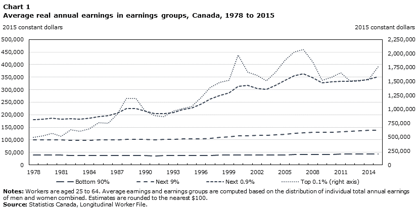
Data table for Chart 1
| Bottom 90% | Next 9% | Next 0.9% | Top 0.1% (right axis) | |
|---|---|---|---|---|
| 2015 constant dollars | ||||
| 1978 | 39,900 | 100,500 | 180,500 | 494,100 |
| 1979 | 39,700 | 100,200 | 182,300 | 518,700 |
| 1980 | 39,600 | 100,900 | 186,200 | 563,800 |
| 1981 | 39,000 | 100,400 | 183,100 | 509,100 |
| 1982 | 37,800 | 98,800 | 185,400 | 635,000 |
| 1983 | 37,100 | 97,700 | 182,400 | 599,900 |
| 1984 | 37,300 | 98,300 | 185,600 | 652,400 |
| 1985 | 37,400 | 99,100 | 193,400 | 760,900 |
| 1986 | 37,200 | 99,100 | 195,800 | 745,100 |
| 1987 | 37,300 | 99,800 | 207,300 | 907,100 |
| 1988 | 37,600 | 102,400 | 224,400 | 1,196,300 |
| 1989 | 37,800 | 102,600 | 225,700 | 1,192,100 |
| 1990 | 37,400 | 101,900 | 214,500 | 969,700 |
| 1991 | 36,400 | 100,300 | 205,000 | 885,800 |
| 1992 | 37,000 | 101,800 | 204,600 | 870,400 |
| 1993 | 36,900 | 101,400 | 209,500 | 966,500 |
| 1994 | 37,500 | 103,200 | 219,800 | 1,012,200 |
| 1995 | 37,400 | 103,700 | 227,700 | 1,051,100 |
| 1996 | 37,500 | 104,600 | 242,100 | 1,213,000 |
| 1997 | 37,900 | 107,000 | 263,700 | 1,395,500 |
| 1998 | 38,600 | 110,500 | 278,000 | 1,483,600 |
| 1999 | 39,100 | 112,500 | 287,700 | 1,515,900 |
| 2000 | 39,700 | 115,500 | 313,100 | 1,972,500 |
| 2001 | 39,600 | 117,000 | 317,900 | 1,665,400 |
| 2002 | 39,700 | 117,300 | 304,300 | 1,610,200 |
| 2003 | 39,600 | 117,100 | 300,900 | 1,506,400 |
| 2004 | 40,100 | 119,600 | 316,300 | 1,662,900 |
| 2005 | 40,500 | 122,300 | 338,000 | 1,883,600 |
| 2006 | 41,100 | 125,200 | 355,600 | 2,020,800 |
| 2007 | 41,800 | 128,300 | 363,000 | 2,073,500 |
| 2008 | 42,400 | 130,100 | 347,600 | 1,841,400 |
| 2009 | 42,300 | 129,400 | 326,800 | 1,516,900 |
| 2010 | 42,600 | 130,700 | 330,500 | 1,574,100 |
| 2011 | 42,900 | 131,800 | 333,400 | 1,655,200 |
| 2012 | 43,600 | 134,100 | 332,800 | 1,506,400 |
| 2013 | 44,300 | 136,700 | 335,600 | 1,514,200 |
| 2014 | 44,500 | 137,600 | 341,400 | 1,523,400 |
| 2015 | 44,600 | 137,400 | 352,200 | 1,764,100 |
|
Notes: Workers are aged 25 to 64. Average earnings and earnings groups are computed based on the distribution of individual total annual earnings of men and women combined. Estimates are rounded to the nearest $100. Source: Statistics Canada, Longitudinal Worker File. |
||||
In an accounting sense, the impact of these trends on the overall gender earnings gap is determined by two factors: the representation of women within each earnings group, and the earnings of women relative to those of men within each group. Both of these factors are addressed in the analysis.
The share of women in top earnings groups increased considerably over the period from 1978 to 2015. However, women remained significantly under-represented in each group by the end of the period. From the mid-2000s onwards, women accounted for 48% of all earners and for just over 50% of earners in the bottom 90% (Chart 2).
The share of women in the next 9% increased from nearly 7% to 25%, resulting in a male-to-female ratio of 3:1 in 2015. Similarly, the share of women in the next 0.9% increased from 3% to 17%, resulting in a male-to-female ratio of nearly 5:1. In the top 0.1%, the percentage of women tripled from almost 4% to 12%, resulting in a male-to-female ratio of about 7:1.
Clearly, gains were made in the representation of women. Yet despite this, women remain significantly under-represented in each top earnings group. In Canada, men in the top 0.1% number in the tens of thousands, while women number in the thousands.

Data table for Chart 2
| All | Bottom 90% | Next 9% | Next 0.9% | Top 0.1% | |
|---|---|---|---|---|---|
| percent | |||||
| 1978 | 37.7 | 41.2 | 6.7 | 2.8 | 3.6 |
| 1979 | 38.7 | 42.3 | 6.9 | 3.2 | 3.0 |
| 1980 | 39.5 | 43.1 | 7.4 | 4.2 | 3.5 |
| 1981 | 40.4 | 44.1 | 7.9 | 4.3 | 3.4 |
| 1982 | 40.9 | 44.5 | 9.5 | 3.9 | 4.1 |
| 1983 | 41.4 | 45.0 | 9.5 | 4.4 | 4.0 |
| 1984 | 42.0 | 45.7 | 9.5 | 4.5 | 4.2 |
| 1985 | 42.5 | 46.2 | 10.0 | 5.1 | 4.5 |
| 1986 | 43.1 | 46.7 | 10.6 | 6.5 | 4.7 |
| 1987 | 43.7 | 47.3 | 11.4 | 7.6 | 5.9 |
| 1988 | 44.2 | 47.8 | 12.3 | 8.7 | 6.1 |
| 1989 | 44.7 | 48.2 | 12.8 | 9.1 | 6.8 |
| 1990 | 45.1 | 48.6 | 14.2 | 8.0 | 6.5 |
| 1991 | 45.4 | 48.8 | 15.9 | 8.5 | 6.3 |
| 1992 | 45.7 | 49.0 | 17.6 | 9.4 | 6.4 |
| 1993 | 45.9 | 49.0 | 18.6 | 9.6 | 7.1 |
| 1994 | 45.9 | 49.1 | 17.7 | 10.3 | 6.6 |
| 1995 | 46.0 | 49.2 | 17.5 | 10.6 | 6.3 |
| 1996 | 46.0 | 49.2 | 17.9 | 11.0 | 7.0 |
| 1997 | 46.1 | 49.3 | 17.4 | 12.1 | 6.7 |
| 1998 | 46.3 | 49.5 | 18.5 | 13.0 | 7.4 |
| 1999 | 46.6 | 49.8 | 18.9 | 13.9 | 8.8 |
| 2000 | 46.9 | 50.0 | 20.2 | 14.1 | 9.4 |
| 2001 | 47.1 | 50.1 | 20.1 | 14.7 | 9.2 |
| 2002 | 47.3 | 50.2 | 21.2 | 15.3 | 9.3 |
| 2003 | 47.4 | 50.3 | 22.1 | 15.4 | 9.8 |
| 2004 | 47.5 | 50.4 | 22.6 | 15.6 | 9.0 |
| 2005 | 47.6 | 50.5 | 22.5 | 16.0 | 9.6 |
| 2006 | 47.8 | 50.6 | 22.6 | 16.2 | 9.5 |
| 2007 | 47.9 | 50.7 | 23.3 | 16.1 | 10.1 |
| 2008 | 47.9 | 50.7 | 23.7 | 16.2 | 10.0 |
| 2009 | 48.1 | 50.7 | 26.2 | 16.0 | 11.7 |
| 2010 | 48.1 | 50.7 | 25.5 | 16.2 | 10.7 |
| 2011 | 48.1 | 50.7 | 25.3 | 16.4 | 11.1 |
| 2012 | 48.0 | 50.6 | 24.6 | 16.3 | 11.3 |
| 2013 | 47.9 | 50.6 | 24.4 | 16.7 | 12.5 |
| 2014 | 47.9 | 50.7 | 24.1 | 16.5 | 12.0 |
| 2015 | 48.0 | 50.6 | 25.1 | 17.5 | 12.0 |
|
Notes: Workers are aged 25 to 64. Earnings groups are computed based on the distribution of individual total annual earnings of men and women combined. Source: Statistics Canada, Longitudinal Worker File. |
|||||
The annual earnings of women relative to those of men varied across the top earnings groups. In the next 9% and the next 0.9%, the average annual earnings of women corresponded to more than 95% of the average earnings of men over most of the reference period (Chart 3). This suggests that when women reach the top 10% of the earnings distribution (but shy of the top 0.1%), they work at similar intensities and pay rates to those of men. In the top 0.1%, the annual earnings of women relative to those of men have been falling over time until the late 1990s, after which the trend appears to have reversed. However, the estimates for the 0.1% are sensitive to the business cycle and are more unstable given the smaller underlying sample size.Note 9
In the bottom 90%, the average annual earnings of women relative to those of men increased considerably over the reference period, rising from about 63% in the late 1970s and about 69% throughout most of the 1980s, to over 75% throughout most of the 1990s, to nearly 85% by the late 2000s. In Chart 3, of particular note is the widening difference in the gender earnings ratio between the bottom 90% and all earners. As explained above, men are over-represented among the top 10% of earners, meaning that when the gender earnings ratio is computed for the bottom 90% rather than for all earners, more highly paid men than highly paid women are excluded. This results in a substantially higher gender earnings ratio for the bottom 90% that displays more growth than the gender earnings ratio among all workers. Indeed, the difference between the gender earnings ratio for the bottom 90% and the entire distribution increased from almost 9 percentage points in 1978 to around 15 percentage points in 2015. For women in the bottom 90%—the vast majority of women—the female/male average annual earnings ratio is substantially more favourable and improving faster than the overall numbers would suggest. This underscores the importance of better understanding the top 10% in the evolution of the overall gender earnings gap in Canada.
Note that men’s and women’s earnings are compared within four earnings groups bounded from top and bottom by the same thresholds (except for the top 0.1% where earnings are theoretically unbounded at the top). However, even if men and women were equally likely to reach each of these earnings groups, the range of possible annual earnings in each group is large enough that one would not expect the average earnings of men and women to be equalized automatically and the pay gap to disappear. Furthermore, the range of possible earnings in the three highest groups chosen for this study is larger than in the bottom 90%. This fact has implications for the contribution of each group to the overall gender earnings gap as shown by the following accounting exercise.
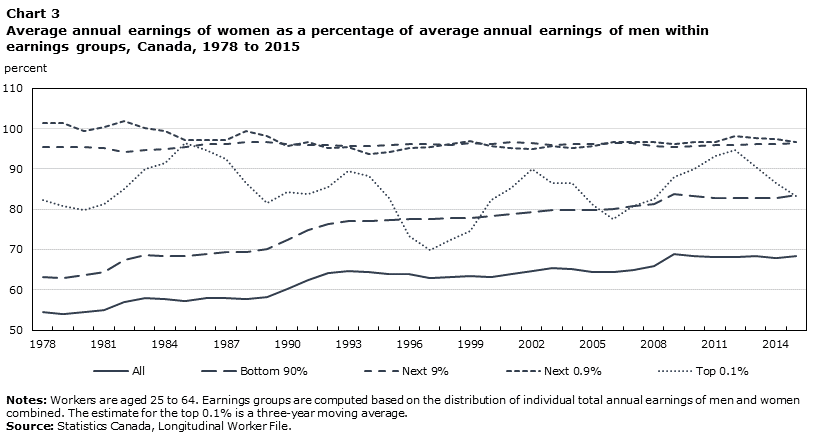
Data table for Chart 3
| All | Bottom 90% | Next 9% | Next 0.9% | Top 0.1% | |
|---|---|---|---|---|---|
| percent | |||||
| 1978 | 54.4 | 63.1 | 95.5 | 101.4 | 82.3 |
| 1979 | 54.0 | 62.9 | 95.4 | 101.4 | 80.8 |
| 1980 | 54.6 | 63.7 | 95.4 | 99.5 | 79.8 |
| 1981 | 54.9 | 64.3 | 95.1 | 100.4 | 81.2 |
| 1982 | 57.0 | 67.3 | 94.3 | 101.9 | 85.1 |
| 1983 | 57.9 | 68.7 | 94.7 | 100.1 | 89.9 |
| 1984 | 57.6 | 68.4 | 94.9 | 99.4 | 91.4 |
| 1985 | 57.2 | 68.3 | 95.5 | 97.2 | 96.4 |
| 1986 | 57.9 | 68.9 | 96.1 | 97.2 | 94.7 |
| 1987 | 58.0 | 69.4 | 96.3 | 97.1 | 92.5 |
| 1988 | 57.6 | 69.5 | 96.8 | 99.3 | 86.4 |
| 1989 | 58.2 | 70.2 | 96.6 | 98.2 | 81.6 |
| 1990 | 60.2 | 72.4 | 96.2 | 95.7 | 84.2 |
| 1991 | 62.4 | 74.8 | 96.0 | 96.8 | 83.7 |
| 1992 | 64.2 | 76.4 | 96.0 | 95.1 | 85.5 |
| 1993 | 64.6 | 77.0 | 95.6 | 95.5 | 89.5 |
| 1994 | 64.3 | 77.1 | 95.6 | 93.7 | 88.4 |
| 1995 | 64.0 | 77.3 | 95.9 | 94.1 | 82.9 |
| 1996 | 63.8 | 77.5 | 96.1 | 95.2 | 73.3 |
| 1997 | 63.0 | 77.5 | 96.2 | 95.4 | 69.8 |
| 1998 | 63.2 | 77.7 | 96.0 | 96.1 | 72.3 |
| 1999 | 63.5 | 77.8 | 96.4 | 97.0 | 74.7 |
| 2000 | 63.1 | 78.3 | 96.2 | 95.6 | 82.3 |
| 2001 | 63.8 | 78.8 | 96.8 | 95.3 | 85.3 |
| 2002 | 64.7 | 79.3 | 96.5 | 94.9 | 90.0 |
| 2003 | 65.5 | 79.7 | 96.0 | 95.6 | 86.6 |
| 2004 | 65.1 | 79.7 | 96.2 | 95.2 | 86.6 |
| 2005 | 64.5 | 79.7 | 96.2 | 95.7 | 81.1 |
| 2006 | 64.4 | 80.1 | 96.4 | 96.8 | 77.7 |
| 2007 | 64.8 | 80.7 | 96.4 | 96.6 | 80.9 |
| 2008 | 66.0 | 81.2 | 95.8 | 96.6 | 82.6 |
| 2009 | 69.0 | 83.7 | 95.5 | 96.3 | 87.9 |
| 2010 | 68.5 | 83.2 | 95.6 | 96.7 | 90.0 |
| 2011 | 68.2 | 82.9 | 95.9 | 96.7 | 93.2 |
| 2012 | 68.2 | 82.7 | 96.0 | 98.2 | 94.7 |
| 2013 | 68.4 | 82.8 | 96.2 | 97.7 | 90.6 |
| 2014 | 68.0 | 82.8 | 96.3 | 97.4 | 86.6 |
| 2015 | 68.5 | 83.5 | 96.4 | 96.7 | 83.3 |
|
Notes: Workers are aged 25 to 64. Earnings groups are computed based on the distribution of individual total annual earnings of men and women combined. The estimate for the top 0.1% is a three-year moving average. Source: Statistics Canada, Longitudinal Worker File. |
|||||
Table 1 performs an accounting exercise that brings some of these stylized facts together; it focuses on four years, 1980, 1990, 2000, and 2015.Note 10 Because the earnings distribution has been partitioned into four mutually exclusive groups, the total (column) average earnings of men (or of women) can be written as the weighted sum of the average earnings of men (or of women) in each partition. The average earnings are displayed in the columns entitled “Average Annual Earnings” for each partition, the bottom 90%, the next 9%, the next 0.9%, and the top 0.1%, shown on different rows. The weights used to add up these average earnings to the total average earnings for each year are reported in the columns “Proportion”.
These proportions can be computed as follows, using 2015 as an example. Chart 2 shows that, in 2015, the shares of women in the bottom 90%, the next 9%, the next 0.9%, and the top 0.1%, are 50.6%, 25.1%, 17.5% and 12.0%, respectively. This implies that the shares of men across the four groupings are 49.5%, 74.9%, 82.5%, and 88.0%. Therefore, considering the proportion of workers in the four groups among men and women separately, there will be a lower proportion of men in the bottom 90% than exactly 90% and a higher proportion of men than the size of bins in the next groups. The reverse will apply to women. Because women make up only 48% of the sample, the computation of the exact proportions divides the product of the shares by the size of the bins by this number rather than by half. More precisely, among women, the proportion of workers in the bottom 90% will be more than 90%, 50.6% × 90% ÷ 48% = 94.9%. In the next 9%, it will be 25.1% × 9% ÷ 48% = 4.7%, in the next 0.9%, it will correspond to 17.5% × 0.9% ÷ 48% = 0.33% and in the top 0.1% to 12% × 0.1% ÷ 48% = 0.025%.Note 11
Next, the column “Contribution to the Overall Earnings Gap” of each group is computed as the row difference between the weighted average male earnings and the weighted average female earnings, where the weighted gender-specific average earnings are the product of the proportion of workers and their average earnings in each row. These differences are expressed in dollar amounts, as well as in percentages of the total earnings gap reported in the “Total” row of each panel. The last column “Gender Earnings Ratio” computes the ratio of the weighted average female earnings to the weighted average male earnings and reports the same numbers as those illustrated in Chart 3.Note 12
There are several important stylized facts to gather from this accounting exercise. First, the contribution of the top 10% (the sum of the next 9%, next 0.09% and top 0.1%) to the overall gender earnings gap is always greater than the contribution of the bottom 90% and increases dramatically over time. More precisely, it increases from 60% in 1980, to 72% in 1990, to 81% in 2000 and 86% in 2015. Conversely, the contribution of the bottom 90% is diminishing over time. Second, the growth in relative importance of the top 1% had slowed down following the global financial crisis of 2008-2009, a phenomenon that can be attributed to a decline in top 0.1% earnings, as shown in the table. Third, although the gender ratios appear more favourable among top earners, in the upper 95% range, because the corresponding earnings gap represents substantial dollar amounts, they should not be overlooked as one considers the different sources of the overall gender pay gap. Fourth, the overall gender ratios are much less favorable than within-group gender ratios underlining the importance of vertical segregation in the gender pay gap.Note 13
| Men | Women | Contribution to the Overall Gender Earnings Gap | Gender Earnings Ratio | ||||
|---|---|---|---|---|---|---|---|
| Proportion | Average Annual Earnings | Proportion | Average Annual Earnings | ||||
| dollars | dollars | dollars | percent | ||||
| A: 1980 | |||||||
| Bottom 90% | 0.846 | 47,000 | 0.982 | 29,900 | 10,300 | 40 | 0.637 |
| Next 9% | 0.138 | 101,200 | 0.017 | 96,600 | 12,300 | 47 | 0.954 |
| Next 0.9% | 0.014 | 186,200 | 0.001 | 185,200 | 2,500 | 10 | 0.995 |
| Top 0.1% | 0.002 | 568,300 | 0.000 | 441,500 | 900 | 3 | 0.777 |
| Total | 1.000 | 57,300 | 1.000 | 31,200 | 26,000 | 100 | 0.546 |
| B: 1990 | |||||||
| Bottom 90% | 0.842 | 43,100 | 0.970 | 31,200 | 6,000 | 27 | 0.724 |
| Next 9% | 0.141 | 102,500 | 0.028 | 98,600 | 11,600 | 52 | 0.962 |
| Next 0.9% | 0.015 | 215,200 | 0.002 | 205,900 | 2,900 | 13 | 0.957 |
| Top 0.1% | 0.002 | 983,800 | 0.000 | 768,300 | 1,600 | 7 | 0.781 |
| Total | 1.000 | 55,700 | 1.000 | 33,500 | 22,200 | 100 | 0.602 |
| C: 2000 | |||||||
| Bottom 90% | 0.848 | 44,500 | 0.958 | 34,800 | 4,400 | 19 | 0.783 |
| Next 9% | 0.135 | 116,400 | 0.039 | 111,900 | 11,400 | 50 | 0.962 |
| Next 0.9% | 0.015 | 315,100 | 0.003 | 301,300 | 3,800 | 17 | 0.956 |
| Top 0.1% | 0.002 | 2,012,400 | 0.000 | 1,586,900 | 3,100 | 14 | 0.789 |
| Total | 1.000 | 61,600 | 1.000 | 38,900 | 22,700 | 100 | 0.631 |
| D: 2015 | |||||||
| Bottom 90% | 0.854 | 48,600 | 0.949 | 40,600 | 3,000 | 14 | 0.835 |
| Next 9% | 0.130 | 138,600 | 0.047 | 133,700 | 11,700 | 55 | 0.964 |
| Next 0.9% | 0.014 | 354,200 | 0.003 | 342,700 | 3,900 | 18 | 0.967 |
| Top 0.1% | 0.002 | 1,809,300 | 0.000 | 1,433,900 | 2,700 | 13 | 0.793 |
| Total | 1.000 | 67,700 | 1.000 | 46,400 | 21,300 | 100 | 0.685 |
|
Notes: Workers are aged 25 to 64. All dollar amounts are in 2015 dollars and are rounded to the nearest $100. All multiplications were carried out on unrounded numbers, hence the numbers shown in the last three columns may not match corresponding calculations conducted on the numbers displayed in the first four columns. Source: Statistics Canada, Longitudinal Worker File. |
|||||||
What if more women entered the top 10%?
Another way to assess the importance of the top 10% for the overall gender pay gap is to ask the following hypothetical question: what would the gender earnings ratio be if the shares of women in each of the four earnings groups were the same as the shares of men?Note 14 In other words, how much does the under-representation of women among top earners contribute to the gender earnings gap in Canada? While this study is not the first to construct counterfactuals based on positional ranks,Note 15 it is important to acknowledge some potential pitfalls associated with such counterfactuals. Clearly, counterfactuals asking “what if the representation of women across all centiles or deciles of the combined earnings distribution were the same as men's?” would explain all average gender differences in earnings. The focus here is on the impact of the under-representation of women in the top decile on the overall average gender pay gap. The average annual earnings of women and men within each group remain unchanged in this exercise. The hypothetical and actual gender earnings ratios are plotted in Chart 4.
If women were distributed across earnings centiles in the same proportions as men, the gender earnings ratio in 2015 would have increased from nearly 69% (actual) to nearly 88% (hypothetical), which is equal to the gender earnings gap narrowing from 31% (actual) to 12% (hypothetical).Note 16 In other words, the under-representation of women accounted for 19 out of the 31 percentage points (or 61%) of the gender earnings gap.
Moreover, the under-representation of women among top earners appears to account for a growing portion of the gender earnings gap. From 1978 to 1980, the under-representation of women among top earners accounted for about 41% of the gender earnings gap, while from 2001 to 2015, it accounted for about 60% on average.
This is important because traditional factors that account for the gender earnings gap, such as education, work experience, occupation and unionization, continue to leave a substantial portion of the gap unexplained. Blau and Kahn (2016) suggest that complementary explanations might include gender differences in employment distributions. In this context, the under-representation of women among top earners as a single factor, accounted for 61% of the gender earnings gap in 2015. Baker and Drolet (2010) also note that in areas such as educational attainment, women have increasingly better outcomes than men; but, because women’s wages have not increased commensurately, these factors have negative explanatory power towards the earnings gap. However, Baker and Drolet argue that the most significant exception is the industrial distribution of employment, in which men still have a significant advantage.

Data table for Chart 4
| Actual ratio | Simulated ratio | |
|---|---|---|
| percent | ||
| 1978 | 54.4 | 72.9 |
| 1979 | 54.0 | 72.7 |
| 1980 | 54.6 | 73.3 |
| 1981 | 54.9 | 73.9 |
| 1982 | 57.0 | 76.0 |
| 1983 | 57.9 | 77.2 |
| 1984 | 57.6 | 77.3 |
| 1985 | 57.2 | 77.2 |
| 1986 | 57.9 | 78.2 |
| 1987 | 58.0 | 78.4 |
| 1988 | 57.6 | 78.5 |
| 1989 | 58.2 | 79.1 |
| 1990 | 60.2 | 80.1 |
| 1991 | 62.4 | 82.0 |
| 1992 | 64.2 | 82.8 |
| 1993 | 64.6 | 83.1 |
| 1994 | 64.3 | 83.6 |
| 1995 | 64.0 | 83.3 |
| 1996 | 63.8 | 83.0 |
| 1997 | 63.0 | 83.3 |
| 1998 | 63.2 | 83.4 |
| 1999 | 63.5 | 83.9 |
| 2000 | 63.1 | 84.2 |
| 2001 | 63.8 | 85.4 |
| 2002 | 64.7 | 85.1 |
| 2003 | 65.5 | 85.7 |
| 2004 | 65.1 | 85.3 |
| 2005 | 64.5 | 85.5 |
| 2006 | 64.4 | 85.5 |
| 2007 | 64.8 | 85.7 |
| 2008 | 66.0 | 86.8 |
| 2009 | 69.0 | 87.6 |
| 2010 | 68.5 | 87.8 |
| 2011 | 68.2 | 88.1 |
| 2012 | 68.2 | 87.7 |
| 2013 | 68.4 | 87.9 |
| 2014 | 68.0 | 87.7 |
| 2015 | 68.5 | 87.8 |
|
Notes: Workers are aged 25 to 64. The simulated yearly ratios are computed as the ratio of counterfactual female earnings to the actual male earnings. For the simulated ratio, the average counterfactual female earnings are computed using the male shares in four earnings groups (bottom 90%, next 9%, next 0.9% and top 0.1%) as weights to aggregate the average earnings of women in those earnings groups. In contrast, the actual female earnings can be computed using the female shares. The under-representation of women accounted for 19 out of the 31 percentage points (or 61%) of the actual 2015 gender earnings gap. Source: Statistics Canada, Longitudinal Worker File. |
||
Impact of industrial distribution
The LWF does not include information on the occupations or educational attainment of taxfilers, and, therefore, the role of these factors in the gender earnings gap cannot be examined. However, the LWF does include consistent information on the industry sector, and a consistent industry classification is available from 1991 to 2015, which allows the role of industry in the gender earnings gap to be explored.Note 17 Note, however, that the industry “effects” that can be studied encompass the effects of other factors that may vary systematically across broad industry groups, such as occupation, education and incidence of part-time employment. These factors cannot be accounted for in these data. Table 2 shows the distributions of workers by gender and earnings groups across 11 industries for two five-year time periods—1991 to 1995 and 2011 to 2015—corresponding to the beginning and end of the reference period used in this part of the analysis.
As expected, there exists a substantial difference in the distribution of male and female workers across industries. Much larger shares of men are employed in mining, oil and gas, utilities, and construction; manufacturing; and wholesale trade, transportation and warehousing. Conversely, much larger shares of women are employed in educational services, and health care and social assistance. The decline in manufacturing employment and the increase in employment in mining, oil and gas, utilities, and construction from the early 1990s to the late 2000s is evident when comparing the top and bottom panels of Table 2. These shifts had a greater impact on men given their over-representation in these industries.Note 18
The novel feature of Table 2 is the industry distribution of men and women within each of the four earnings groups. As expected, the industry distribution of the bottom 90% is quite similar to the industry distribution of all workers. When the industry share of a top earnings group is higher than that of all workers, workers in that industry are more likely to be found in the top 9%, top 0.9% or top 0.1% of the earnings distribution. When the industry share of a top earnings group is lower, workers are less likely to be at the top of the earnings distribution.
Table 2 reveals that the representation in different centile groupings for a given industry varies more among women than men and, furthermore, follows different patterns. First, the representation of women (in percentage) is similar across the centile groupings in sectors such as manufacturing, and wholesale trade, transportation and warehousing. Second,despite strong representation in the bottom 90%, the representation of women declines at higher levels of the earnings distribution in retail trade, health care and social assistance, and in other services (except public administration). Third, there is over-representation (by comparison with the overall industrial distribution) in the next 9%, but under-representation in the top 1%, in educational services and in public administration. Finally, some sectors, such as the finance, insurance and real estate sector and the professional, scientific and business services sector, dominate among top earners.
| Total | Men | Total | Women | |||||||
|---|---|---|---|---|---|---|---|---|---|---|
| Bottom 90% | Next 9% | Next 0.9% | Top 0.1% | Bottom 90% | Next 9% | Next 0.9% | Top 0.1% | |||
| percent | ||||||||||
| Panel A: 1991 to 1995 | ||||||||||
| Agriculture, forestry, fishing and hunting | 2.3 | 2.7 | 0.5 | 0.7 | 1.1 | 1.3 | 1.4 | 0.3 | 1.3 | Note x: suppressed to meet the confidentiality requirements of the Statistics Act |
| Mining, oil and gas, utilities, and construction | 12.2 | 11.9 | 14.2 | 11.1 | 11.7 | 2.7 | 2.6 | 3.9 | 5.5 | 10.7 |
| Manufacturing | 21.9 | 22.0 | 21.9 | 19.1 | 16.4 | 9.7 | 9.9 | 5.6 | 10.4 | 11.9 |
| Wholesale trade, transportation and warehousing | 13.6 | 14.1 | 10.4 | 16.0 | 13.1 | 6.8 | 6.8 | 5.0 | 10.3 | 15.5 |
| Retail trade | 7.8 | 8.6 | 3.4 | 4.3 | 5.6 | 10.8 | 11.1 | 3.2 | 5.5 | 7.2 |
| Finance, insurance and real estate | 4.7 | 4.2 | 6.1 | 17.0 | 28.2 | 9.2 | 9.2 | 7.9 | 21.1 | 25.7 |
| Professional, scientific and business services | 7.3 | 7.2 | 7.2 | 12.9 | 15.4 | 7.7 | 7.7 | 7.4 | 15.1 | 17.0 |
| Educational services | 6.0 | 5.1 | 11.9 | 3.4 | 0.1 | 11.0 | 10.2 | 33.0 | 4.1 | Note x: suppressed to meet the confidentiality requirements of the Statistics Act |
| Health care and social assistance | 3.0 | 3.1 | 1.9 | 3.1 | 1.9 | 17.2 | 17.3 | 12.6 | 7.5 | 5.1 |
| Other services (except public administration) | 10.1 | 10.7 | 6.7 | 6.7 | 6.1 | 14.1 | 14.3 | 8.2 | 9.4 | 3.9 |
| Public administration | 11.2 | 10.6 | 15.7 | 5.7 | 0.2 | 9.6 | 9.5 | 13.0 | 9.8 | Note x: suppressed to meet the confidentiality requirements of the Statistics Act |
| Total | 100.0 | 100.0 | 100.0 | 100.0 | 100.0 | 100.0 | 100.0 | 100.0 | 100.0 | 100.0 |
| Panel B: 2011 to 2015 | ||||||||||
| Agriculture, forestry, fishing and hunting | 1.7 | 2.0 | 0.4 | 0.3 | 0.4 | 0.9 | 0.9 | 0.2 | 0.2 | Note x: suppressed to meet the confidentiality requirements of the Statistics Act |
| Mining, oil and gas, utilities, and construction | 15.8 | 14.4 | 23.9 | 22.4 | 16.9 | 3.4 | 3.1 | 8.6 | 12.8 | 11.2 |
| Manufacturing | 15.3 | 15.8 | 12.5 | 9.7 | 8.6 | 6.3 | 6.3 | 5.6 | 6.2 | 6.0 |
| Wholesale trade, transportation and warehousing | 13.0 | 13.2 | 11.9 | 13.2 | 10.5 | 6.5 | 6.4 | 7.5 | 10.9 | 8.6 |
| Retail trade | 8.4 | 9.2 | 3.8 | 4.1 | 3.4 | 10.8 | 11.1 | 4.5 | 5.2 | 9.2 |
| Finance, insurance and real estate | 5.0 | 4.3 | 7.5 | 18.7 | 36.2 | 7.8 | 7.6 | 12.4 | 23.6 | 42.8 |
| Professional, scientific and business services | 12.7 | 12.3 | 14.5 | 17.5 | 15.7 | 10.7 | 10.5 | 13.2 | 17.8 | 14.1 |
| Educational services | 4.8 | 5.0 | 4.5 | 1.2 | Note x: suppressed to meet the confidentiality requirements of the Statistics Act | 11.4 | 11.4 | 10.8 | 2.4 | Note x: suppressed to meet the confidentiality requirements of the Statistics Act |
| Health care and social assistance | 3.6 | 3.7 | 3.0 | 4.3 | 2.0 | 19.2 | 19.5 | 14.1 | 8.3 | 2.5 |
| Other services (except public administration) | 11.3 | 12.1 | 6.2 | 6.1 | 6.2 | 13.7 | 14.1 | 6.9 | 7.6 | 4.5 |
| Public administration | 8.4 | 8.0 | 11.9 | 2.4 | Note x: suppressed to meet the confidentiality requirements of the Statistics Act | 9.3 | 9.0 | 16.1 | 5.0 | Note x: suppressed to meet the confidentiality requirements of the Statistics Act |
| Total | 100.0 | 100.0 | 100.0 | 100.0 | 100.0 | 100.0 | 100.0 | 100.0 | 100.0 | 100.0 |
|
x suppressed to meet the confidentiality requirements of the Statistics Act Note: Percentages may not add up to 100.0% because of rounding. Source: Statistics Canada, Longitudinal Worker File. |
||||||||||
Because of these different patterns of representation in top earnings groups, industry composition captures a mix of vertical gender segregation (i.e., segregation across the echelons of corporate and administrative hierarchies) and horizontal gender segregation (i.e., segregation between activities at similar echelons of different corporate hierarchies). In fact, the industrial distributions of men and women are much more similar in the next 0.9% and top 0.1% of the annual earnings distribution than in the next 9% or bottom 90%. For example, Panel B of Table 2 shows that the top three industrial sectors for the top 0.9% and top 0.1% (finance, insurance and real estate; professional, scientific and business services; and mining, oil and gas, utilities, and construction) are the same for men and women. For the next 9%, the top three industrial sectors are gender-specific. For men, they are mining, oil and gas, utilities, and construction; manufacturing; and professional, scientific and business services.For women, they are health care and social assistance; public administration; and professional, scientific and business services. Therefore, it is natural to ask whether women in the next 9% or the bottom 90% would benefit from entering traditionally male sectors in larger numbers.
To examine this hypothesis more directly, a counterfactual of the average annual earnings of women was calculated assuming that women in each of the four earnings centiles were distributed across industries in the same proportions as men. The counterfactual earnings of women were then compared with actual earnings of men in these same centiles to generate the counterfactual earnings ratios shown in Chart 5. In other words, this is how the annual earnings of women in the next 9%, for example, would compare with the annual earnings of men in the same centile group if both were distributed in the same way across industries.
The results show that if women from each of the four centiles worked in the same industries as their male counterparts, the overall simulated gender ratio in annual earnings would be smaller by less than 1 percentage point than the actual gender earnings ratio (68.8% in 2015). Similarly the simulated gender ratio in annual earnings in the bottom 90% would be smaller by 1.1 to 2.4 percentage points than the actual ratio (83.7% in 2015). However, in the next 9%, women working in the same industries as men would result in a simulated gender ratio 1.4 to 2.3 percentage points higher than the actual gender ratio (96.4% in 2015). The sample size is too small to provide simulated results for the next 0.9% and top 0.1%.Note 19

Data table for Chart 5
| Actual earnings ratio, all | Actual earnings ratio, bottom 90% | Actual earnings ratio, next 9% | Simulated earnings ratio, all | Simulated earnings ratio, bottom 90% | Simulated earnings ratio, next 9% | |
|---|---|---|---|---|---|---|
| percent | ||||||
| 1991 | 62.4 | 74.8 | 96.0 | 61.3 | 73.2 | 97.7 |
| 1992 | 64.1 | 76.4 | 96.0 | 62.8 | 74.4 | 97.7 |
| 1993 | 64.6 | 76.9 | 95.7 | 63.4 | 75.1 | 97.8 |
| 1994 | 64.4 | 77.1 | 95.7 | 63.2 | 75.4 | 97.5 |
| 1995 | 64.1 | 77.2 | 95.9 | 63.0 | 75.6 | 97.8 |
| 1996 | 63.8 | 77.5 | 96.1 | 63.0 | 76.1 | 98.2 |
| 1997 | 63.1 | 77.5 | 96.2 | 62.3 | 76.2 | 98.1 |
| 1998 | 63.3 | 77.6 | 96.0 | 62.7 | 76.5 | 98.1 |
| 1999 | 63.6 | 77.9 | 96.4 | 62.9 | 76.7 | 98.2 |
| 2000 | 63.4 | 78.3 | 96.2 | 62.4 | 76.7 | 98.2 |
| 2001 | 63.9 | 78.8 | 96.8 | 62.8 | 77.0 | 98.2 |
| 2002 | 64.7 | 79.3 | 96.5 | 63.5 | 77.4 | 98.0 |
| 2003 | 65.5 | 79.7 | 96.0 | 64.3 | 77.8 | 97.7 |
| 2004 | 65.0 | 79.6 | 96.2 | 64.0 | 77.9 | 98.0 |
| 2005 | 64.6 | 79.7 | 96.2 | 63.6 | 78.0 | 98.0 |
| 2006 | 64.5 | 80.1 | 96.4 | 63.6 | 78.5 | 98.1 |
| 2007 | 64.9 | 80.7 | 96.3 | 64.0 | 79.0 | 98.2 |
| 2008 | 66.0 | 81.2 | 95.8 | 65.1 | 79.6 | 97.8 |
| 2009 | 69.0 | 83.7 | 95.5 | 67.7 | 81.3 | 97.8 |
| 2010 | 68.5 | 83.3 | 95.6 | 67.3 | 81.2 | 97.8 |
| 2011 | 68.4 | 83.0 | 95.9 | 67.3 | 81.0 | 98.1 |
| 2012 | 68.3 | 82.8 | 96.0 | 67.2 | 81.0 | 97.9 |
| 2013 | 68.5 | 82.9 | 96.2 | 67.5 | 81.2 | 98.0 |
| 2014 | 68.1 | 82.9 | 96.3 | 67.2 | 81.3 | 98.2 |
| 2015 | 68.8 | 83.7 | 96.4 | 67.8 | 82.0 | 98.4 |
|
Notes: Workers are aged 25 to 64. The simulated yearly ratios are computed as the ratio of counterfactual female earnings to the actual male earnings. The average counterfactual female earnings are computed using the male shares in 11 industry sectors in each of the four earnings group (bottom 90%, next 9%, next 0.9% and top 0.1%) as weights to aggregate the average earnings of women in those earnings groups. In contrast, the actual female earnings can be computed using the corresponding female shares. Source: Statistics Canada, Longitudinal Worker File. |
||||||
One might ask how gender differences in average annual earnings would change if the overall distribution of women and men across industries remained unchanged, but if women within each sector were as likely as men to hold jobs in the upper earnings centiles. In short, how would things change if “glass ceilings” were removed within industries? To answer this, a counterfactual of the average annual earnings of women was calculated assuming that, within each industry, women were as likely as men to be in the next 9%, next 0.9% and top 0.1%.
The impact on the overall gender earnings ratio is shown in Chart 6. Specifically, the simulated gender earnings ratio in the absence of glass ceilings within industries would have been about 17 percentage points higher in 2015 than the actual ratio (68.8%). This simulation yields results that are very similar to those obtained from the scenario where women were distributed across the four earnings centiles in the same proportions as men (Chart 4), without explicitly accounting for distribution across industry sectors.Note 20
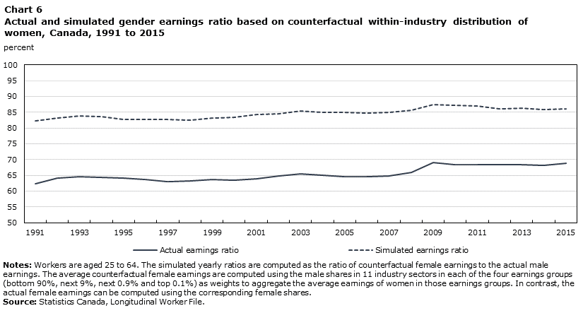
Data table for Chart 6
| Actual earnings ratio | Simulated earnings ratio | |
|---|---|---|
| percent | ||
| 1991 | 62.4 | 82.3 |
| 1992 | 64.1 | 83.2 |
| 1993 | 64.6 | 83.8 |
| 1994 | 64.4 | 83.7 |
| 1995 | 64.1 | 82.8 |
| 1996 | 63.8 | 82.6 |
| 1997 | 63.1 | 82.7 |
| 1998 | 63.3 | 82.5 |
| 1999 | 63.6 | 83.1 |
| 2000 | 63.4 | 83.4 |
| 2001 | 63.9 | 84.3 |
| 2002 | 64.7 | 84.4 |
| 2003 | 65.5 | 85.3 |
| 2004 | 65.0 | 85.0 |
| 2005 | 64.6 | 85.0 |
| 2006 | 64.5 | 84.7 |
| 2007 | 64.9 | 85.0 |
| 2008 | 66.0 | 85.7 |
| 2009 | 69.0 | 87.4 |
| 2010 | 68.5 | 87.1 |
| 2011 | 68.4 | 87.0 |
| 2012 | 68.3 | 86.1 |
| 2013 | 68.5 | 86.2 |
| 2014 | 68.1 | 85.9 |
| 2015 | 68.8 | 86.1 |
|
Notes: Workers are aged 25 to 64. The simulated yearly ratios are computed as the ratio of counterfactual female earnings to the actual male earnings. The average counterfactual female earnings are computed using the male shares in 11 industry sectors in each of the four earnings groups (bottom 90%, next 9%, next 0.9% and top 0.1%) as weights to aggregate the average earnings of women in those earnings groups. In contrast, the actual female earnings can be computed using the corresponding female shares. Source: Statistics Canada, Longitudinal Worker File. |
||
Overall, the two counterfactual exercises above suggest that enabling women to move into the upper earnings echelons within industries would likely have a far larger impact on the overall gender earnings ratio than enabling women to move across industries within earnings centiles.
Conclusion
This paper explores the consequences of increases in top income inequality on the overall gender earnings gap over the period from 1978 to 2015. The major findings shed new light on gender pay differentials in Canada.
First, the results confirm that men continue to outnumber women in top earnings groups, at 3:1 for individuals in the next 9%, about 5:1 for individuals in the next 0.9% and about 7:1 for individuals in the top 0.1%. Nevertheless, there has been some progress in the representation of women in top earnings groups over the study period.
Second, the gender earnings ratio of individuals in the bottom 90% of the annual earnings distribution has been about 9 to 16 percentage points higher than the ratio in the overall distribution over the study period. The slowdown in the progress in the overall gender ratio is consistent with a “swimming upstream” effect of increases in top incomes. An accounting exercise shows that the share of the overall gender earnings gap arising from the gap among the top 10% of earners has grown over time from 60% in 1980 to 86% in the 2015. More generally, progress stalled in periods of faster increases in top incomes, such as the 1990s, but accelerated following the global financial crisis in 2008-2009, which hit top earners harder. In contrast, the gender earnings ratio in the bottom 90% of individuals has seen more constant progress, that is until 2008.
Third, counterfactual experiments that replace female shares with male shares in the four selected centile groupings show that the under-representation of women in top earnings groups contributes to a previously unrecognized majority share of the unexplained earnings gap. This result is consistent with the hypothesis that vertical gender segregation plays a significant role in the persisting gender pay gap. In that regard, however, there is substantial heterogeneity across industrial sectors.
Fourth, the counterfactual experiments replacing female industrial distribution with male industrial distribution to compute average earnings by gender within centile groupings show that only women in top earnings groups would benefit from moving into traditionally male sectors. Moreover, the within-industry counterfactual experiments show that improvements in the gender pay gap resulting from women climbing into the upper earnings echelons within industries would be far larger than potential improvements resulting from women moving across industries within similar earnings echelons.
With increasing earnings inequality in top incomes, further improvements in the representation of women among top earners will likely be necessary for the continued decline in the gender earnings gap in the 21st century.
Start of text boxData and methods
This study uses data from three versions of the LWF: (a) the 1978−1989 LWF, (b) the 1983−2010 LWF, and (c) the 1989−2015 LWF. The three versions are combined to create a single series of earnings data spanning the period 1978 to 2015 as follows:
Step 1: Individual-level earnings were obtained from all three versions. In the 1978−1989 and 1983−2010 LWF, only earnings data from T4 files are available. The 1989−2015 LWF contains both total earnings as reported in T1 files and in T4 files. Since T1 earnings are assessed by the Canada Revenue Agency, these earnings were used for the period 1989 to 2015 where available; otherwise, earnings from T4 files were used.
Step 2: In each year, the sample was restricted to individuals with earnings above a minimum threshold. The minimum earnings threshold is computed as earnings obtained from working 40 hours per week for 13 weeks per year at one-half the provincial minimum wage in a given year. Earnings were then converted into 2015 dollars.
Step 3: Earnings data for the years 1983 to 1988 from the 1983−2010 LWF were anchored to the 1989−2015 LWF using an adjustment factor, following the approach in Morissette (2018). The adjustment factor is the ratio of mean earnings in 1989 in the 1989−2015 LWF and in the 1983−2010 LWF, calculated separately by sex and percentile (bottom 90%, next 9%, next 0.9% and top 0.1%).
Step 4: Earnings data for the year 1978 to 1982 from the 1978−1989 LWF were anchored to the adjusted data from the 1983−2010 LWF using an adjustment factor obtained from the common year 1983.
| Year | 90th percentile | 99th percentile | 99.9th percentile |
|---|---|---|---|
| 2015 constant dollars | |||
| 1978 | 83,000 | 144,000 | 297,000 |
| 1979 | 83,000 | 143,000 | 314,000 |
| 1980 | 83,000 | 145,000 | 323,000 |
| 1981 | 83,000 | 145,000 | 308,000 |
| 1982 | 82,000 | 144,000 | 334,000 |
| 1983 | 81,000 | 141,000 | 328,000 |
| 1984 | 82,000 | 142,000 | 334,000 |
| 1985 | 82,000 | 145,000 | 368,000 |
| 1986 | 82,000 | 147,000 | 367,000 |
| 1987 | 83,000 | 150,000 | 414,000 |
| 1988 | 84,000 | 157,000 | 476,000 |
| 1989 | 84,000 | 158,000 | 486,000 |
| 1990 | 83,000 | 155,000 | 432,000 |
| 1991 | 82,000 | 150,000 | 407,000 |
| 1992 | 84,000 | 151,000 | 390,000 |
| 1993 | 84,000 | 151,000 | 435,000 |
| 1994 | 85,000 | 155,000 | 472,000 |
| 1995 | 85,000 | 159,000 | 477,000 |
| 1996 | 85,000 | 164,000 | 534,000 |
| 1997 | 86,000 | 172,000 | 613,000 |
| 1998 | 88,000 | 181,000 | 651,000 |
| 1999 | 89,000 | 187,000 | 666,000 |
| 2000 | 90,000 | 199,000 | 761,000 |
| 2001 | 90,000 | 203,000 | 745,000 |
| 2002 | 91,000 | 200,000 | 683,000 |
| 2003 | 91,000 | 199,000 | 668,000 |
| 2004 | 93,000 | 206,000 | 711,000 |
| 2005 | 94,000 | 215,000 | 801,000 |
| 2006 | 96,000 | 223,000 | 872,000 |
| 2007 | 97,000 | 229,000 | 886,000 |
| 2008 | 99,000 | 227,000 | 794,000 |
| 2009 | 99,000 | 222,000 | 700,000 |
| 2010 | 100,000 | 224,000 | 719,000 |
| 2011 | 101,000 | 227,000 | 709,000 |
| 2012 | 102,000 | 229,000 | 690,000 |
| 2013 | 104,000 | 233,000 | 699,000 |
| 2014 | 104,000 | 236,000 | 712,000 |
| 2015 | 104,000 | 238,000 | 761,000 |
|
Note: Estimates are rounded to the nearest $1,000. Source: Statistics Canada, Longitudinal Worker File. |
|||
References
Albrecht, J., A. Björklund, and S. Vroman. 2003. “Is there a glass ceiling in Sweden?” Journal of Labor Economics 21 (1): 145–177.
Arulampalam, W., A.L. Booth, and M.L. Bryan. 2007. “Is there a glass ceiling over Europe? Exploring the gender pay gap across the wage distribution.” Industrial and Labor Relations Review 60 (2): 163–186.
Atkinson, A.B., Casarico, A., and S. Voitchovsky 2018. "Top incomes and the gender divide." Journal of Economic Inequality 16 (2): 225–256.
Baker, M., and M. Drolet. 2010. “A new view of the male/female pay gap.” Canadian Public Policy 36 (4): 429–464.
Bayer, P., and K.K. Charles. 2016. Divergent paths: Structural change, economic rank, and the evolution of black-white earnings differences, 1940-2014. no. w22797. Cambridge, Massachusetts: National Bureau of Economic Research.
Blau, F.D., and L.M. Kahn. 2016. The Gender Wage Gap: Extent, Trends, and Explanations. no. w21913. Cambridge, Massachusetts: National Bureau of Economic Research.
DiNardo, J., N.M. Fortin, and T. Lemieux. 1996. “Labor market institutions and the distribution of wages, 1973–1992: A semiparametric approach”. Econometrica 64 (5): 1001–1046.
Drolet. 2002. “New Evidence on Gender Pay Differentials: Does Measurement Matter?” Canadian Public Policy 28 (1): 1–16.
Fortin, N.M., and T. Lemieux. 1998. “Rank regressions, wage distributions, and the gender gap.” Journal of Human Resources 33 (3): 610–643.
Fortin, N.M., B. Bell, and M. Boehm. 2017. “Top earnings inequality and the gender pay gap: Canada, Sweden, and the United Kingdom.” Labour Economics 47: 107–123.
Fortin, N.M. 2018. “Increasing earnings inequality and the gender pay gap in Canada: Prospects for convergence.” Article prepared for the Canadian Journal of Economics.
Guvenen, F., G. Kaplan, and J. Song. 2014. The Glass Ceiling and the Paper Floor: Gender Differences Among Top Earners, 1981-2012. no. w20560. Cambridge, Massachusetts: National Bureau of Economic Research.
Kline, P. 2011. “Oaxaca-Blinder as a reweighting estimator.” American Economic Review 101 (3): 532–537.
Morissette, R. 2018. Wages for Young Workers up to the Age of 40. Analytical Studies Branch Research Paper Series, no. 405. Statistics Canada Catalogue no. 11F0019M. Ottawa: Statistics Canada.
Piketty, T., and E. Saez. 2003. “Income inequality in the United States, 1913–1998.” Quarterly Journal of Economics 118 (1): 1–41.
Piketty, T., and E. Saez. 2013. “Top incomes and the Great Recession: Recent evolutions and policy implications.” IMF Economic Review 61 (3): 456–478.
Richards, E. 2019. Who Are the Working Women in Canada’s Top 1%? Analytical Studies Branch Research Paper Series, no. 414. Statistics Canada Catalogue no. 11F0019M. Ottawa: Statistics Canada.
Statistics Canada. n.d. Table 11-10-0055-01 High income tax filers in Canada. Available at: http://www150.statcan.gc.ca/t1/tbl1/en/tv.action?pid=1110005501 (accessed February 4, 2019).
- Date modified: