Infographic 1
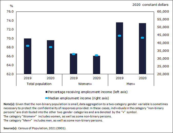
Fewer women received employment income in 2020

Infographic description
The title of the infographic is "Fewer women received employment income in 2020"
This is a bar chart with data points and a double axis.
The left vertical axis shows the percentage of the population receiving employment income from 62.0% to 76.0%, by increments of 2.
The right vertical axis shows the median employment income in 2020 constant dollars from $20,000 to $60,000, by increments of $5,000.
The horizontal axis shows the following categories: Total population, Women+, and Men+. Each category is further divided into the following periods: 2019 and 2020.
The first set of bars represents the percentage of the total population receiving employment income, with 70.0% in 2019, and 69.6% in 2020.
The first set of data points represent the median employment income of the total population, with $38,000 in 2019 and $37,200 in 2020.
The second set of bars represents the percentage of the population of "Women+" receiving employment income, with 66.6% in 2019 and 66.1% in 2020.
The second set of data points represent the median employment income of "Women+," with $32,800 in 2019 and $32,000 in 2020.
The third set of bars represents the percentage of the population of "Men+" receiving employment income, with 73.6% in 2019 and 73.4% in 2020.
The third set of data points represent the median employment income of "Men+," with $44,400 in 2019 and $43,200 in 2020.
Note(s): Given that the non-binary population is small, data aggregation to a two-category gender variable is sometimes necessary to protect the confidentiality of responses provided. In these cases, individuals in the category "non-binary persons" are distributed into the other two gender categories and are denoted by the "+" symbol. The category "Men+" includes men, as well as some non-binary persons. The category "Women+" includes women, as well as some non-binary persons.
Source(s): Census of Population, 2021 (3901).
- Date modified: