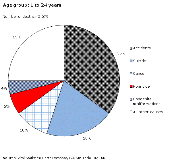
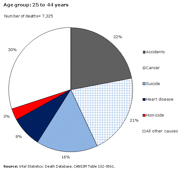
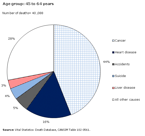
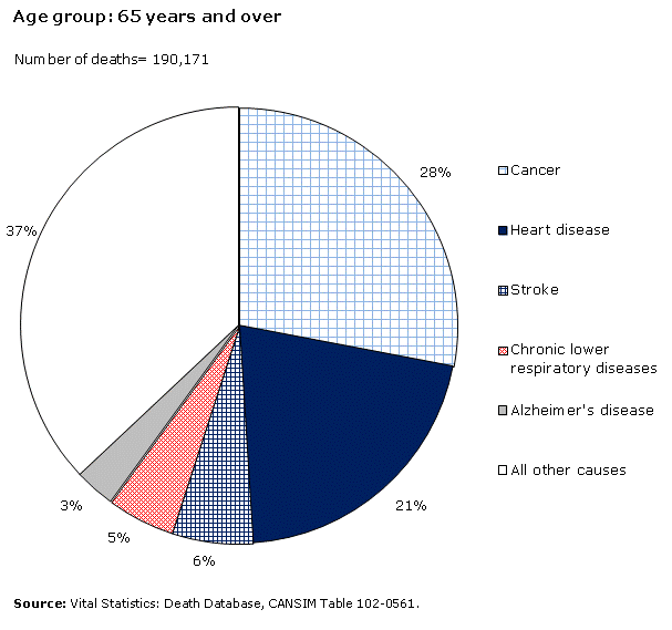
Chart 1
Percentage distribution for the 5 leading causes of death in Canada, 2011

This is an amalgamated chart composed of four pie charts, with one pie chart for each age group.

Chart 1

Chart 2

Chart 3

Chart 4

Description for chart 1

Report a problem on this page

Is something not working? Is there information outdated? Can't find what you're looking for?

Please contact us and let us know how we can help you.

Privacy notice

Date modified: