
Prices Analytical Series
Recent trends in new house prices in the Greater Golden Horseshoe region

Archived Content
Information identified as archived is provided for reference, research or recordkeeping purposes. It is not subject to the Government of Canada Web Standards and has not been altered or updated since it was archived. Please "contact us" to request a format other than those available.
by Rohit Verma and Melanie Beaupré
Recent months have taken some of the shine off the new housing market in Ontario’s Greater Golden Horseshoe (GGH) region. The area, anchored by Toronto and wrapped around the western end of Lake Ontario has, in recent years, been one of the most active in Canada in terms of the high prices of new homes.
Map
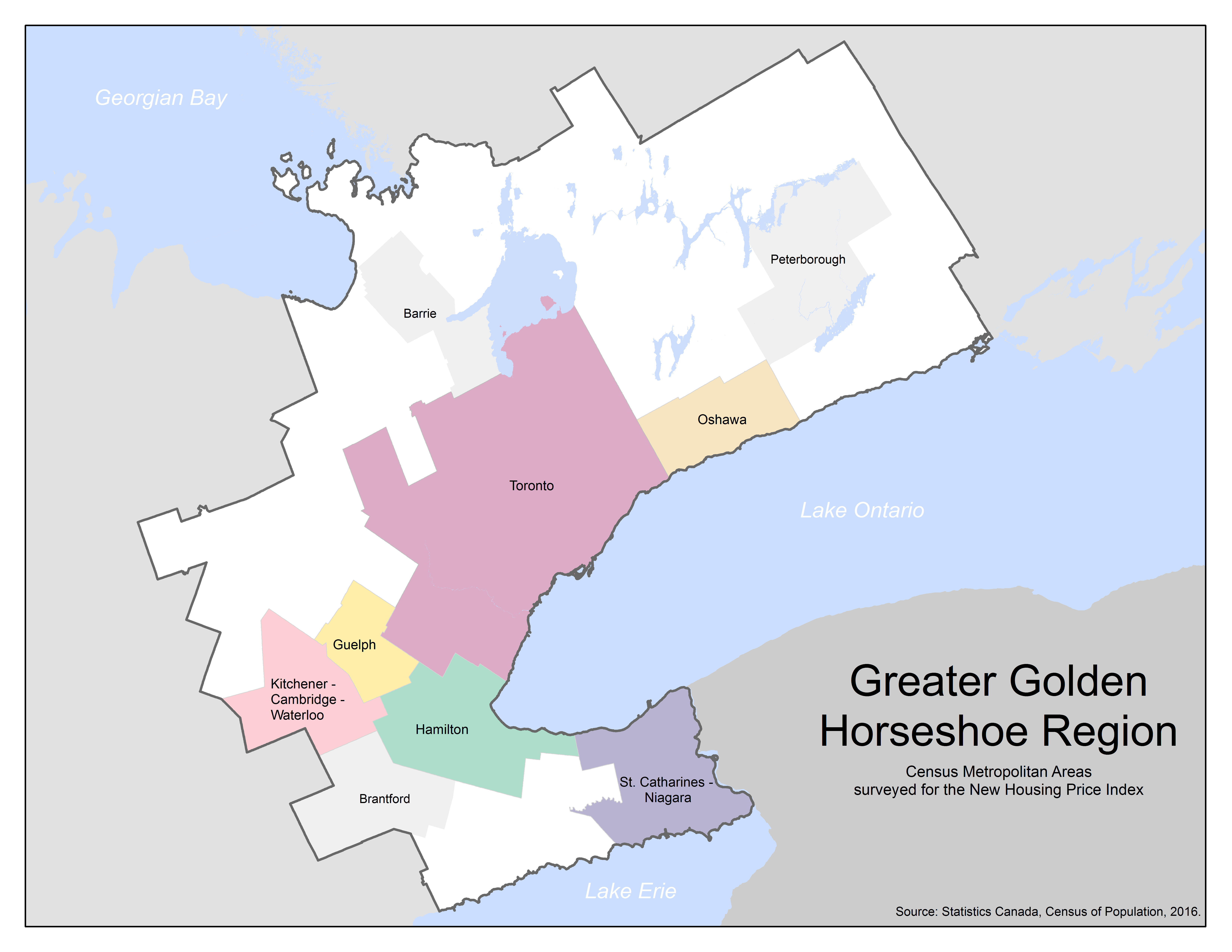
Description for Map
Map of the Greater Golden Horseshoe (GGH) region to situate the GGH region and the six Census Metropolitan Areas (CMAs) surveyed by the New Housing Price Index.
On this map, the boundaries of the Greater Golden Horseshoe region are indicated by a dark grey line. The six CMAs surveyed for the New Housing Price Index are shaded in different colours within the Greater Golden Horseshoe region. The CMAs surveyed are Oshawa coloured in beige, Toronto in dark pink, Hamilton in green, St. Catharines-Niagara in purple, Guelph in bright yellow and Kitchener-Cambridge-Waterloo in light pink.
The non-surveyed CMAs of Peterborough, Barrie and Brantford are coloured in light gray. The rest of Ontario is coloured in medium gray, the U.S. in a darker gray and the bodies of water are blue.
Toronto, Canada’s most populous census metropolitan area (CMA), which is home to 5.9 million residents, has historically been one of the country’s pricier housing markets. Between May 2015 and May 2017, prices for new homes rose 16%. Growth in population, demand for new homes, as well as the higher cost of developed land contributed to the price gains.
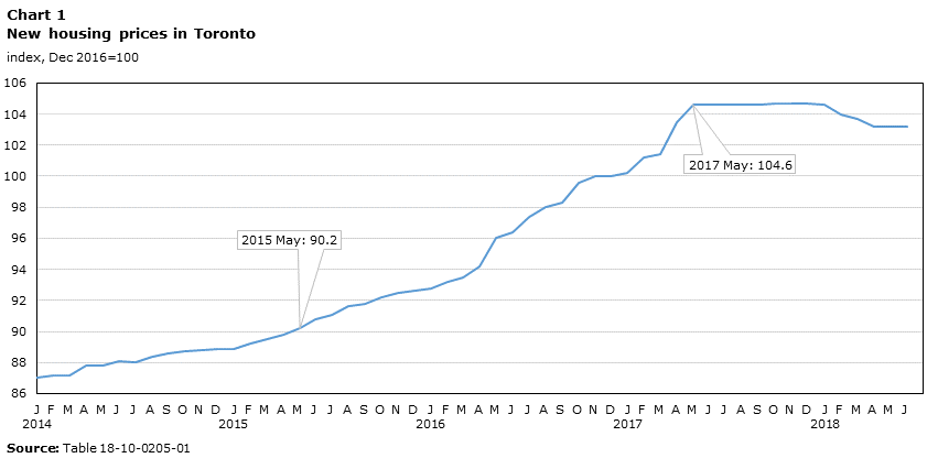
Data table for Chart 1
| Toronto | |
|---|---|
| index, Dec 2016=100 | |
| 2014 | |
| January | 87.0 |
| February | 87.2 |
| March | 87.2 |
| April | 87.8 |
| May | 87.8 |
| June | 88.1 |
| July | 88.0 |
| August | 88.4 |
| September | 88.6 |
| October | 88.7 |
| November | 88.8 |
| December | 88.9 |
| 2015 | |
| January | 88.9 |
| February | 89.2 |
| March | 89.5 |
| April | 89.8 |
| May | 90.2 |
| June | 90.8 |
| July | 91.1 |
| August | 91.6 |
| September | 91.8 |
| October | 92.2 |
| November | 92.5 |
| December | 92.6 |
| 2016 | |
| January | 92.8 |
| February | 93.2 |
| March | 93.5 |
| April | 94.2 |
| May | 96.0 |
| June | 96.4 |
| July | 97.4 |
| August | 98.0 |
| September | 98.3 |
| October | 99.6 |
| November | 100.0 |
| December | 100.0 |
| 2017 | |
| January | 100.2 |
| February | 101.2 |
| March | 101.4 |
| April | 103.5 |
| May | 104.6 |
| June | 104.6 |
| July | 104.6 |
| August | 104.6 |
| September | 104.6 |
| October | 104.7 |
| November | 104.7 |
| December | 104.7 |
| 2018 | |
| January | 104.6 |
| February | 104.0 |
| March | 103.7 |
| April | 103.2 |
| May | 103.2 |
| June | 103.2 |
| Source: Table 18-10-0205-01 | |
The high price tags for new and resale homes in Toronto made commuter-friendly and nearby CMAs such as Oshawa, Hamilton, St. Catharines-Niagara, Guelph and Kitchener-Cambridge-Waterloo increasingly popular among home buyers, due to their overall affordability. As house prices continued to climb in Toronto, the spillover effect was felt in the surrounding CMAs, with prices rising across the GGH region until May 2017.

Data table for Chart 2
| Oshawa | Toronto | Hamilton | St. Catharines-Niagara | Kitchener-Cambridge-Waterloo | Guelph | |
|---|---|---|---|---|---|---|
| 2017 | month-over-month % change | |||||
| January | 0.0 | 0.2 | 0.6 | 0.9 | 1.0 | 0.4 |
| February | 1.2 | 1.0 | 1.0 | 0.1 | 0.5 | 1.4 |
| March | 1.1 | 0.2 | 0.0 | 0.0 | 0.2 | 0.9 |
| April | 1.4 | 2.1 | 0.0 | 1.8 | 1.5 | 0.0 |
| May | 0.0 | 1.1 | 0.0 | 0.9 | 0.4 | 1.7 |
| June | 0.0 | 0.0 | 0.0 | 0.1 | 0.1 | 0.0 |
| July | 0.0 | 0.0 | 1.5 | 0.1 | 0.0 | 0.0 |
| August | 0.0 | 0.0 | 0.0 | 0.0 | 0.0 | 0.0 |
| September | 0.9 | 0.0 | 0.0 | 0.6 | 0.0 | 0.0 |
| October | 0.0 | 0.1 | 0.0 | 0.0 | -0.1 | 0.0 |
| November | 0.0 | 0.0 | 0.0 | 0.0 | 0.0 | 0.1 |
| December | 0.0 | 0.0 | -0.1 | 0.0 | 0.0 | 0.1 |
| 2018 | ||||||
| January | 0.3 | -0.1 | 0.2 | 0.0 | 0.0 | 0.0 |
| February | -0.1 | -0.6 | -0.1 | 0.4 | 0.0 | 0.0 |
| March | 0.0 | -0.3 | 0.1 | 0.2 | 0.0 | 0.1 |
| April | -0.1 | -0.5 | 0.2 | 0.0 | 0.0 | 0.0 |
| May | 0.0 | 0.0 | 0.2 | 0.1 | 0.2 | 0.3 |
| June | -0.3 | 0.0 | 0.1 | 0.5 | 0.0 | 0.0 |
| Source: Table 18-10-0205-02 | ||||||
New home prices paused soon after the introduction of the Fair Housing Plan
As home prices were increasing and, so too, concerns about affordability, the Ontario government, in an attempt to cool the housing market, introduced the Ontario Fair Housing Plan in April 2017. The plan included a 15% Non-Resident Speculation Tax, as well as measures to increase housing supply in Ontario. This was followed by several mortgage rate hikes by Canadian lenders in the second half of 2017.
The new measures, combined with higher lending rates, coincided with a pause in new home prices in Toronto and nearby CMAs in the GGH region.
Introduction of stress test and further hikes in mortgage rates
In January 2018, the federal regulators – Office of the Superintendent of Financial Institutions Canada (OSFI), tightened mortgage regulations by introducing a stress test. It requires the minimum qualifying rate for uninsured mortgages to be the greater of the five-year benchmark rate published by the Bank of Canada or the contractual rate plus 2%. This led to reduced purchasing power for most potential borrowers. This was further dampened by increasing mortgage rates in the first half of 2018.
As provincial and national regulations were implemented, and mortgage rates increased, new home buyers in the GGH region saw an overall flatness in prices. In Toronto, new home prices were largely unchanged from June to December 2017, followed by a few price declines in 2018. Other surveyed CMAs in the GGH region also saw muted prices in the second half of 2017, but contrary to Toronto, for the most part, they did not experience declines in the first half of 2018.

Data table for Chart 3
| Oshawa | Toronto | Hamilton | St. Catharines-Niagara | Kitchener-Cambridge-Waterloo | Guelph | |
|---|---|---|---|---|---|---|
| 2016 | ||||||
| December | 100.0 | 100.0 | 100.0 | 100.0 | 100.0 | 100.0 |
| 2017 | ||||||
| January | 100.0 | 100.2 | 100.6 | 100.9 | 101.0 | 100.4 |
| February | 101.2 | 101.2 | 101.6 | 101.0 | 101.5 | 101.8 |
| March | 102.3 | 101.4 | 101.6 | 101.0 | 101.7 | 102.7 |
| AprilData table Note 1 | 103.7 | 103.5 | 101.6 | 102.8 | 103.2 | 102.7 |
| May | 103.7 | 104.6 | 101.6 | 103.7 | 103.6 | 104.4 |
| June | 103.7 | 104.6 | 101.6 | 103.8 | 103.7 | 104.4 |
| JulyData table Note 2 | 103.7 | 104.6 | 103.1 | 103.9 | 103.7 | 104.4 |
| August | 103.7 | 104.6 | 103.1 | 103.9 | 103.7 | 104.4 |
| SeptemberData table Note 3 | 104.6 | 104.6 | 103.1 | 104.5 | 103.7 | 104.4 |
| OctoberData table Note 4 | 104.6 | 104.7 | 103.1 | 104.5 | 103.6 | 104.4 |
| November | 104.6 | 104.7 | 103.1 | 104.5 | 103.6 | 104.5 |
| December | 104.6 | 104.7 | 103.0 | 104.5 | 103.6 | 104.6 |
| 2018 | ||||||
| JanuaryData table Note 5 | 104.9 | 104.6 | 103.2 | 104.5 | 103.6 | 104.6 |
| February | 104.8 | 104.0 | 103.1 | 104.9 | 103.6 | 104.6 |
| March | 104.8 | 103.7 | 103.2 | 105.1 | 103.6 | 104.7 |
| April | 104.7 | 103.2 | 103.4 | 105.1 | 103.6 | 104.7 |
| MayData table Note 6 | 104.7 | 103.2 | 103.6 | 105.2 | 103.8 | 105.0 |
| June | 104.4 | 103.2 | 103.7 | 105.7 | 103.8 | 105.0 |
|
||||||
Background: Statistics Canada collects new home prices (single, semi-detached and townhouses) under the New Housing Price Index (NHPI) program in 27 CMAs, including six CMAs within the Greater Golden Horseshoe region. The six CMAs surveyed in the region are Toronto, Oshawa, Hamilton, St. Catharines-Niagara, Kitchener-Cambridge-Waterloo, and Guelph.
Acknowledgements
The authors would like to thank everyone who reviewed and contributed to this article, particularly, Serra Erdur, Annie De Champlain, George Bentley, GeoHelp in Statistical Registers and Geography Division and the Dissemination Division.
- Date modified: