
3. Results
Paula Vicente, Elizabeth Reis and �lvaro Rosa
For the purpose of the analysis, we shall consider two "groups� of responses: the initial group and the final group. The initial group includes the freguesias that returned the questionnaires before the follow up date; the final group includes all the freguesias responding to the survey, i.e., the initial group plus the freguesias that returned the questionnaires after the follow up. The two groups are not mutually exclusive.
The analysis starts with a description of the mailing outcomes. We examine response rates (overall and by region) and geographical distribution of the freguesias that could be assigned a risk level (both in the initial and the final versions of the Map of Alert). When making analyses by region, we use the NUTS II classification of the Portuguese territory; this entails six regions - North, Center, Lisbon, Alentejo, Algarve and Archipelagos of Madeira and Azores. In the second stage of the analysis, the responses of the PJFs are analysed by means of Principal Component Analysis with the purpose of reducing the dimensionality of the data and identify latent dimensions of risk. This analysis is performed in both groups of response. Finally an evaluation of the freguesias' risk level classification is made in both the initial and final Map of Alert. Freguesias that did not respond at all to the Perception of Risk survey (referred as non responders) are described according to their geographical distribution.
3.1 Analysis of response rates
Figure 3.1 presents the distribution of the number of questionnaires received per day during the overall collection period (from 10th October 2010 when the first questionnaires were received until the final deadline on 16th February 2011). There are two peaks of response, the first approximately one month after the first mailing went out and the second some days after the follow up mailing. Almost no questionnaires were being received by the time the follow up mailing was sent out, which leads us to believe that no more would have been received without the second mailing.
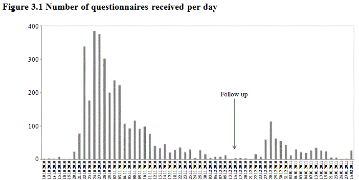
From a total of 4,260 questionnaires sent in the first mailing, 2,457 were answered within the suggested time of response (one month), 816 were answered after that period but before the follow up mailing and 609 were answered after the follow up date. Of the 4,260 freguesias, 378 did not respond. This absence of response was considered to be a refusal since it is unlikely these questionnaires were not delivered as an updated address list was used for mailing. The overall response rate of the survey, computed as the percentage of freguesias that answered the questionnaire out of the total number of freguesias in the population, was 91.1% (Table 3.1).
| N | % | |
|---|---|---|
| Freguesias returning the questionnaire within one month | 2,457 | 57.7 |
| Freguesias returning the questionnaire after one month and before the follow up mailing | 816 | 19.2 |
| Freguesias returning the questionnaire after the follow up mailing | 609 | 14.3 |
| Freguesias not returning the questionnaire | 378 | 8.9 |
| Questionnaires sent | 4,260 | 100.0 |
| Overall freguesias returning the questionnaire | 3,882 | 91.1 |
Table 3.2 presents the response rate per region in the initial and final group. The response rate of the initial mailing ranged from 71% in the North to 88.1% in the Algarve; the final response rate ranged from 87.3% in the North to 96.4% in the Algarve. The follow up mailing allowed an increase both in the overall response rate and in the response rate of each region, but it was more efficient in the North than in other regions. The North had a 16.3% increase in survey participation, in contrast to an increase of approximately 6% in the region of the Archipelagos of Madeira and Azores.
| Region | Initial | Final |
|---|---|---|
| North | 71.0 | 87.3 |
| Center | 79.3 | 91.4 |
| Lisbon | 84.3 | 95.3 |
| Alentejo | 83.1 | 96.0 |
| Algarve | 88.1 | 96.4 |
| Archipelagos of Madeira and Azores | 86.7 | 93.3 |
| Overall | 76.8 | 91.1 |
Table 3.3 presents the geographical distribution of the freguesias with an assigned risk level in the initial and in the final Map of Alert. More than 40% of the freguesias are located in the North and approximately 26% are located in the Center. When comparing the final distribution with that of all the freguesias in the population, the biggest differences are found in the regions of Lisbon (13.1% vs. 7.0%, meaning that the region of Lisbon is overrepresented in the Map of Alert) and Center (26.1% vs. 30.6%, meaning that the region of Center is underrepresented in the Map of Alert). The geographical distribution of the freguesias with an assigned risk level in the final Map is very similar to that of the initial Map.
As to the non responding freguesias, more than half are located in the North and approximately one fourth are located in the Centre. The other regions have less than 10% of the freguesias with no risk level assigned. This pattern is evident in both the initial and final group.
| Region | Freguesias with risk level assigned | Non responders | Population | ||
|---|---|---|---|---|---|
| Initial | Final | Initial | Final | ||
| Nord | 44.0 | 46.1 | 59.5 | 63.2 | 46.6 |
| Center | 26.7 | 26.1 | 23.1 | 23.8 | 30.6 |
| Lisbon | 13.7 | 13.1 | 8.4 | 6.1 | 7.0 |
| Alentejo | 7.7 | 7.5 | 5.2 | 2.6 | 8.9 |
| Algarve | 2.3 | 2.1 | 1.0 | 0.9 | 2.0 |
| Archipelagos of Madeira and Azores | 5.6 | 5.1 | 2.8 | 3.4 | 4.9 |
| N = | 3,264Note avec dagger du tableau 3.3 † | 3,873Note avec dagger du tableau 3.3 † | 987 | 378 | 4,260 |
|
|||||
3.2 Analysis of the PJF responses
In order to simplify the structure of the survey data and identify the potential dimensions of risk affecting the Census operation, two Principal Component Analysis (PCA) were conducted. One of the PCA was made using the five questions about the characteristics of the PJF (age, educational level, time as president of Junta de freguesia, frequency of computer use and frequency of internet use); the other PCA was made using the Likert-type questions about freguesias' characteristics and enumerators recruitment (Sections 1 to 3 of the questionnaire). The eigenvalue over one criterion was adopted to extract the components. Table 3.4 presents the number of principal components (PC) and the percentage of total variance they explain, based on varimax rotation. Both PCAs were performed in the initial and final group of freguesias.
The outcomes reveal that the responses obtained from initial freguesias have an identical structure in the latent dimensions of risk to the responses of the final group of freguesias. The sampling adequacy indicator for the PCA on PJF characteristics was reasonably good (KMO > 0.6) in both the initial and final freguesias data sets. In both data sets two principal components were extracted accounting for approximately 77% of the data variance. The PCs were named as: PCA – PJF’ skills and PCB – PJF’ experience.
| Analysis characteristic | Initial | Final |
|---|---|---|
| PCA on PJF characteristics | ||
| Kaiser-Meyer-Olkin measure of sample adequacy | 0.687 | 0.685 |
| PCs extracted | 2 | 2 |
| Variance explained | 77.3% | 77.2% |
| PCA on freguesias’ characteristics | ||
| Kaiser-Meyer-Olkin measure of sample adequacy | 0.693 | 0.696 |
| PCs extracted | 5 | 5 |
| Variance explained | 61.4% | 61.3% |
The sampling adequacy indicator for the PCA on Likert-type questions was also reasonably good (KMO > 0.6) in both data sets. Five PCs were extracted, both in the initial and final data sets, accounting for nearly 61% of the data variance, namely: PC1 – Hard to reach population, PC2 – Enumerators with suitable skills and available to work in the census, PC3 – Elderly population, PC4 – Deserted areas and PC5 – Areas with high vacancy rates for habitable housing.
Regarding the overall opinion about the degree of difficulty in implementing the Census 2011 operation (question on Section 4 of the questionnaire), the response of nearly 2/3 of the respondents was above the middle point of the scale in both response groups. In the initial group, 67.8% of the respondents rated their answers as level "4� or "5� on the response scale compared with 67.5% in the final group (Table 3.5).
| Initial | Final | |
|---|---|---|
| 1 – “hard” | 1.7 | 1.7 |
| 2 | 3.8 | 3.8 |
| 3 | 26.7 | 27.0 |
| 4 | 38.4 | 37.9 |
| 5 – ”easy” | 29.4 | 29.6 |
3.3 Freguesias' risk level classification
The seven dimensions of risk found with both PCAs were then used as an input in Finite Mixture Modeling and Cluster Analysis to produce a segmentation of the freguesias (details and outputs of this analysis are not presented but can be found on ISCTE-IUL (2011)). The segmentation is made for both the initial and final groups of freguesias. The outcome of the segmentation is presented in the Map of Alert in which the freguesias appear in red, orange or green (the final Map of Alert is presented in Figure A.2 of the Appendix. The dark spots represent the freguesias without an assigned risk level due to non response). Table 3.6 summarizes the freguesias' risk level classification in the initial and final versions of the Map.
| Risk level | Initial (n = 3,264) | Final (n = 3,873) | Δ% |
|---|---|---|---|
| High risk (red) | 6.4 | 3.7 | – 42.2 |
| Medium risk (orange) | 53.3 | 33.9 | – 36.4 |
| Low risk (green) | 40.3 | 62.4 | + 54.8 |
The dominant colour in the initial Map of Alert is orange (53.3% of the freguesias are rated as medium risk). The share of high risk freguesias is only 6.4%. Green predominates in the final Map (62.4% of the freguesias are classified as low risk) and less than 4% of the freguesias are red. Adding the follow up responses to the initial responses resulted in a change in the configuration of the Map of Alert, most notably the increase in the percentage of freguesias rated as low risk (+ 54.8%).
We then analysed how the follow up responses changed the risk level classification of the initial freguesias. The responses of the 3,264 initial freguesias allowed a colour code to be assigned to each freguesia and to draw the initial version of the Map of Alert. After incorporating the responses of the follow up freguesias the Map of Alert was redesigned – not only a higher number of freguesias could have a colour code assigned but also the colour initially attributed to the initial freguesias changed in some cases. Of the 3,264 initial freguesias approximately 50% got a different colour in the final Map of Alert. Figure 3.2 presents the overall changes in risk level classification of initial freguesias after integrating the responses of follow up freguesias.
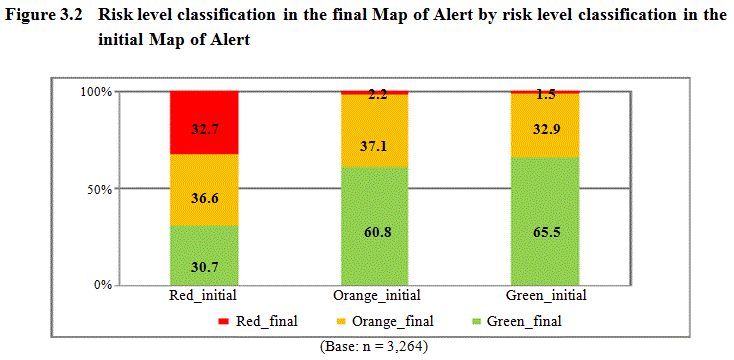
The freguesias that were rated green at the outset (green_initial) tend to stay green (green_final) after considering the follow up responses (65.5%). Only 32.9% of the initially green freguesias changed to orange alert (orange_final) and 1.5% changed to red alert (red_final). As to the freguesias that started out as orange (orange_initial), the follow up responses caused 60.8% to change to green (green_final); only 37.1% remained orange (orange_final) and a minority of 2.2% changed to red (red_final). The biggest change caused by follow up responses is in the red group of freguesias: only 32.7% of the initially red freguesias (red_initial) remained high risk (red_final), and the majority changed either to orange (36.6%) or green (30.7%).
Finally, we analysed risk level classification per region, and compared the initial and final Map (Table 3.7).
| Region | Risk level | Initial | Final | Δ% |
|---|---|---|---|---|
| North | High risk | 4.2 | 0.8 | –81.0 |
| Medium risk | 52.7 | 46.1 | –12.5 | |
| Low risk | 43.1 | 53.1 | +23.2 | |
| Center | High risk | 3.7 | 0.3 | –91.9 |
| Medium risk | 54.8 | 18.6 | –66.1 | |
| Low risk | 41.5 | 81.2 | +95.7 | |
| Lisbon | High risk | 19.1 | 20.3 | +6.3 |
| Medium risk | 45.3 | 24.1 | –46.8 | |
| Low risk | 35.6 | 55.6 | +56.2 | |
| Alentejo | High risk | 4.0 | 1.0 | –75.0 |
| Medium risk | 65.9 | 5.0 | –92.4 | |
| Low risk | 30.1 | 94.0 | +212.3 | |
| Algarve | High risk | 17.0 | 29.8 | +75.3 |
| Medium risk | 43.4 | 38.1 | –12.2 | |
| Low risk | 39.6 | 32.1 | –18.9 | |
| A. Madeira and Azores | High risk | 5.2 | 1.5 | –71.2 |
| Medium risk | 56.0 | 60.9 | +8.8 | |
| Low risk | 38.8 | 37.6 | –3.1 |
Lisbon and Algarve are the regions with higher percentage of freguesias coded as red (19.1% and 17.0%, respectively). This tendency holds both in the initial and final Map of Alert. The follow ups caused a reduction in the percentage of freguesias coded as red in all regions with the exception of Lisbon and Algarve for which the final Map of Alert presents higher percentages of red freguesias than the initial Map. Regarding the percentage of low risk freguesias, the follow ups caused and increased in all regions except Algarve and the Archipelagos of Madeira and Azores in which a decrease was noticed. Additionally, the percentage of orange freguesias decreased in all regions after adding the follow-up responses, except for the Archipelagos of Madeira and Azores.
- Date modified: