
Economic Insights
The Effect of Changing Canada–United States Border Costs on North American Trade Patterns and Expenditures

Archived Content
Information identified as archived is provided for reference, research or recordkeeping purposes. It is not subject to the Government of Canada Web Standards and has not been altered or updated since it was archived. Please "contact us" to request a format other than those available.
Economic Analysis Division, Analytical Studies Branch, Statistics Canada
and Afshan Dar-Brodeur,
Innovation Economics and Market Analysis Directorate, Innovation, Science and Economic Development Canada
This article in the Economic Insights series examines the impact of the Canada–United States border and the potential effects of changing the trade costs it imposes between and within the two countries at a fine geographical scale. The analysis is based on a structural gravity model of trade estimated using Statistics Canada’s Surface Transportation File and the United States Census Bureau’s Commodity Flow Survey. The model estimates the general equilibrium effects that Canada–United States border costs have on trade patterns and welfare, which can be illustrated at a fine regional scale. Maps are used to depict how increases and decreases in border frictions affect not only Canada–United States trade, but also domestic trade flows. The maps show considerable regional variation in both types of trade when conditions at the border change.
Introduction
World trade has expanded since the Second World War, facilitated by the ratification of multilateral and regional trade agreements. These agreements originally focused on disciplining tariffs and quotas applied to goods crossing the border. As tariffs have fallen, attention has turned more toward reducing other costs imposed by administrative borders. One of the earliest regional trade agreements was the 1988 Canada–United States Free Trade Agreement, which Mexico joined in 1994 to create the North American Free Trade Agreement (NAFTA). In 2018, NAFTA was renegotiated, with negotiations focusing less on tariff and quota reductions, and more on subtle factors that affect trade.Note Canadian provinces have also negotiated to further reduce trade barriers within Canada, signing the Canadian Free Trade Agreement (CFTA) in 2017, an update to the Agreement on Internal Trade (AIT). There are no tariffs between provinces: the main frictions are thought to be caused by differences in regulatory frameworks and government procurement practices (Bemrose, Brown and Tweedle 2017).
Traditional trade policies such as tariffs and quotas are easy to identify and measure directly. The frictions caused by divergent regulations, red tape, border-related delivery delays and policy uncertainty facing firms are harder to measure. Moreover, trade between Canada and the United States is continental in scope, but regional in nature: the degree of trade integration between the two countries varies by subnational geography. Within this context, this article presents estimates of border-related costs between and within Canada and the United States.Note It uses these estimates to determine how changing these costs would affect cross-border and domestic trade flows. A series of maps highlights the heterogeneous regional effects of changing border-related costs.
Bilateral trade costs
The border cost estimates reported in this article are based on Statistics Canada’s Surface Transportation File (STF), which covers non-energy goods transported within Canada and to and from the United States. When combined with the U.S. domestic trade flows in the Commodity Flow Survey (CFS), the new resulting dataset covers trade within and between all provinces and states, and between 201 subprovincial and substate regions for 2012.Note
The granularity of the data allows border-related frictions generated by two types of borders—the Canada–United States border and the unmonitored borders between provinces—to be estimated simultaneously.Note Frictions from borders between provinces are associated with regulatory differences and subnational government procurement practices. The international border includes these frictions (likely more severely), as well as tariffs, quotas, customs inspections and other similar irritants.
Border costs are estimated using the structural gravity model, with the results reinterpreted in tariff equivalent form as a way to quantify both tariff and non-tariff barriers comparably.Note These borders have been estimated separately in many papers, but not together, and not with the comprehensive and regionally detailed data from both Canada and the United States used here. The model estimates that the Canada–United States border imposes an average tariff equivalent of 30% between Canadian and U.S. regions.Note This effect is far higher than the 10% that non-tariff barriers impose on inter-provincial trade.Note The difference between total Canada–United States border costs and provincial border costs suggests that the international border imposes an extra administrative burden of roughly 20%.
Changing border costs
Tariff equivalents are informative, but they do not capture the full impact of border frictions. A change in border costs between two regions can also affect the opportunities for producers and consumers in all other regions, particularly those close by. For instance, the cost of trading between Toronto and New York also influences the level of trade between Toronto and Montréal. More generally, changes in border-related costs between Canada and the United States will change the patterns of trade within the two countries.
This article explores two scenarios for changing border costs.
In the first scenario, the cost of trading between Canada and the United States is assumed to be equivalent to trading across provincial borders. This scenario would be consistent with Canada and the United States substantially harmonizing regulations and other trade costs, such that trading with a U.S. region is equivalent to trading with a Canadian one. This would reduce the estimated Canada–United States border effect in terms of the tariff equivalent from 30% to 10%. This scenario serves as a lower bound for a reduction in trade costs.
In the second scenario, Canada and the United States withdraw altogether from a preferential trading agreement. In this case, tariffs would return to their most-favoured-nation (MFN) levels and the bilateral trading relationship would be governed under World Trade Organization (WTO) rules. However, there are valid reasons to believe that trade costs could increase beyond the rise in tariffs. Trade agreements are often in place not only to reduce tariff barriers, but also to ensure a predictable trading environment for businesses. The loss of a preferential trading agreement would increase the level of trade policy uncertainty for exporters, who may be more exposed to various trade actions such as anti-dumping and countervailing duties. To account for these additional non-tariff barriers, this article uses an approximation of the effect NAFTA had on reducing trade costs between the two countries, beyond the reduction in tariffs implied by the trade agreement. This scenario results in a 6-percentage-point increase in trade costs to a 36% tariff equivalent.Note Note
The counterfactual scenario results presented in Table 1 show how changing trade costs affect Canada–United States, domestic Canadian, and domestic U.S. trade, as well as the impact on total expenditures for non-energy goods (i.e., both domestic and imported). The table’s first two columns show the substantial impact on bilateral trade flows between the two countries: reduced border costs lead to an 82% increase in exports from Canada to the United States and a 72% increase in U.S. exports to Canada. Moreover, internal trade within Canada decreases: inter-provincial trade falls by 52% (column 3) and intra-provincial trade falls by over 46% (column 4). In contrast, inter-state and intra-state trade would increase by around 10% (columns 5 and 6, respectively) in the much larger U.S. market. Overall, reduced trade costs and the reallocation of goods flows leads to increased expenditure on domestic and imported goods, up 11.4% in Canada and 0.8% in the United States.Note
The effect of increasing border costs is presented in the bottom half of Table 1. An increase to MFN tariffs plus associated non-tariff barriers reduces Canadian exports to the United States by 23% and U.S. exports to Canada by 18%. Internal trade would increase in Canada as a substitute, with inter-provincial exports rising 11.3% and intra-provincial trade increasing by 9.8%. Domestic U.S. trade would also increase, rising 1.1% for inter-state and 0.7% for intra-state trade. But both Canadian and U.S. consumers lose consumption opportunities overall, with the value of total goods expenditures declining by 1.8% (approximately CAN$10 billion) in Canada and 0.2% (approximately CAN$7 billion) in the United States.
These results show that the effects of changing trade costs are potentially substantial, particularly for the smaller Canadian economy. However, aggregate results can mask regional variation since the degree of integration between Canada and the United States is regional in nature. A series of maps are used in the next section to illustrate the regional variation in changing border cost effects.
| Cross-border exports |
Domestic Canadian exports |
Domestic U.S. exports |
Total expendituresTable 1 Note 1 | |||||
|---|---|---|---|---|---|---|---|---|
| Canada to the United States | United States to Canada | Inter-provincial | Intra-provincial | Inter-state | Intra-state | Canada | United States | |
| percent change | ||||||||
| Reduction in border costs | 82.2 | 71.6 | -52.0 | -46.1 | 8.9 | 10.3 | 11.4 | 0.8 |
| Increase in border costs | -23.4 | -18.1 | 11.3 | 9.8 | 1.1 | 0.7 | -1.8 | -0.2 |
|
||||||||
Regional impacts
The effect of a change in border costs on bilateral Canada–United States trade is presented in Figure 1. Overall, the regional impacts show that aggregate results obscure a pronounced east–west divide for Canada and a northwest–southeast divide for the United States. For the first scenario, in which border costs are reduced (panel A), western United States exports to Canada increase between 56% and 72%, and exports from Texas through the Eastern Seaboard increase between 64% and 80%. In Canada, results are more pronounced for regions in energy-producing Alberta compared with similar regions in other provinces, but this is likely because the energy industry is not included in STF–CFS data.
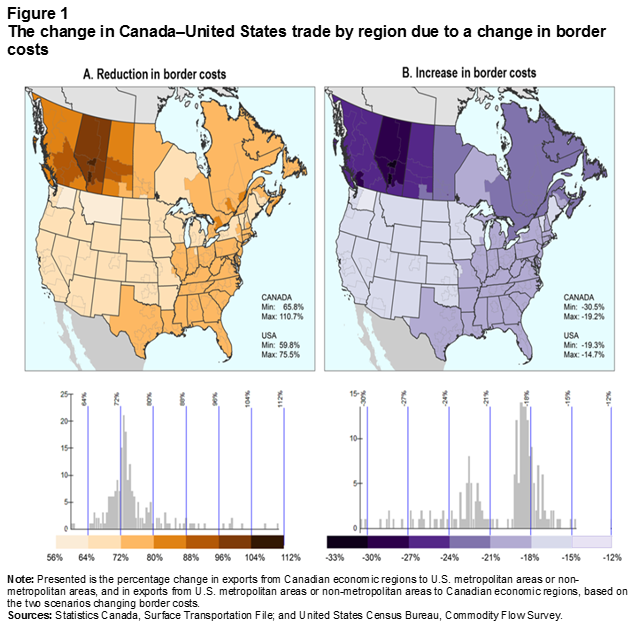
Description for Figure 1
The title of Figure 1 is “The change in Canada–United States trade by region due to a change in border costs.”
Figure 1 has two side-by-side panels, A and B. Both panels feature the same map of Canadian provinces (the territories are not included) and the continental United States. The inter-provincial, intra-provincial, inter-state and intra-state borders are depicted in the maps. Below each map is a bar chart and associated horizontal colour bar located under and along the x-axis of the bar chart. The colour bars have seven shades of colour. At every change in shade there is a vertical line that starts at the top of the colour bar and extends over the bar chart.
The title of panel A is “A. Reduction in border costs.”
The map in panel A depicts the effect on the Canada–United States trade by region when border costs are reduced. The map legend shows the minimum response in the growth of exports from Canadian regions to the United States, which is 65.8%, and the maximum response of 110.7%. The corresponding minimum and maximum in the growth of exports from U.S. regions to Canada are 59.8% and 75.5%, respectively. These are shown in the map legend below the percentages for exports from Canadian regions. The significance of the colours shown in the map is given by the bar chart and associated colour bar.
The graduation of the y-axis in the bar chart associated with the map begins at 0 and ends at 25, with tick marks at every 5 units. The x-axis shows the 0 mark at which it begins. The graduation used for the x-axis is the graduation of the colour bar, which consists of shades of brown. The colour bar and its graduation extend further to the right and to the left of the x-axis. The graduation starts at 56% (at the beginning of lightest shade) and ends at 112% (at the end of darkest shade), with changes in colour at every 8 units. The x-axis starts in the middle of the lightest shade and ends before the end of the darkest shade. There are seven shades of brown in the colour bar. In the bar chart, the bars with the highest values (the value of one bar is more than 20) are close to the 72% unit in the colour bar.
The colours in the map of panel A run from light brown (associated with increases in trade of less than 64%) to dark brown (associated with increases in trade greater than 104%). Most of Canada is more darkly shaded than most of the United States, the three most western provinces are darker than the eastern provinces (increases in trade between 72% and 104%), including Manitoba. The regions of Alberta are the most darkly shaded (increases in trade between 88% and 112%), especially Edmonton and Calgary (increases in trade between 104% and 112%). Western Ontario is the most lightly shaded (increases in trade between 64% and 72%). In the United States, most of the regions are of the same shade as western Ontario. The eastern seaboard and southeast from Florida to Texas are more darkly shaded (increases in trade between 72% and 80%) than the west and mid-west (increases in trade between 56% and 72%), and are similar in colour to Manitoba and eastern Ontario.
The title of panel B is “B. Increase in border costs.”
The map in panel B depicts the effect on the Canada–United States trade by region when border costs are increased. The map legend shows the minimum response in the growth in trade for Canada, which is -30.5%, and the maximum response of -19.2%. The corresponding minimum and maximum responses in the growth of exports from U.S. regions to Canada are -19.3% and 14.7%, respectively. These are shown in the map legend below the percentages for exports from Canadian regions. The significance of the colours shown in the map is given by the bar chart and associated colour bar.
The graduation of the y-axis in the bar chart associated with the map begins at 0 and ends at 15, with tick marks at every 5 units. The x-axis shows the 0 mark at which it begins. The graduation used for the x-axis is the graduation of the colour bar, which consists of shades of purple. The colour bar and its graduation extend further to the right and to the left of the x-axis. The graduation starts at 33% (at the beginning of the darkest shade) and ends at 12% (at the end of the lightest shade), with changes in colour at every 3 units. The x-axis starts close to the end of the darkest shade and ends close to the beginning of the lightest shade. There are seven shades of blue in the colour bar. In the bar chart, the bars with the highest values (one bar has a value of more than 15) are located close to the -18% unit in the colour bar.
The colours in the map of panel B run from dark purple for the biggest decreases in international trade, to light purple for the smallest ones. The patterns in shading mirror those in panel A: Canada is more darkly shaded than the United States. The three western provinces, and especially Alberta, are darker than the rest of Canada (reduction in trade between 33% and 21%). Western Ontario is the most lightly shaded (reduction in trade between 21% and 18%). In the United States, the eastern seaboard and southeast from Florida to Texas are similar in colour to western Ontario. The west and mid-west are lighter purple than the rest of the map (reduction in trade between 18% and 12%).
The note and sources for Figure 1 are as follows:
Note: Presented is the percentage change in exports from Canadian economic regions to U.S. metropolitan areas or non-metropolitan areas, and in exports from U.S. metropolitan areas or non-metropolitan areas to Canadian economic regions, based on the two scenarios changing border costs.
Sources: Statistics Canada, Surface Transportation file; and United States Census Bureau, Commodity Flow Survey.
For additional information, please contact Statistics Canada at STATCAN.infostats-infostats.STATCAN@canada.ca.
These results are contrasted with the internal trade impacts shown in Figure 2. In the first scenario (reduced border costs, panel A), internal trade falls by about half as regions reorient their trade to the U.S. market, regardless of whether the internal trade is inter-provincial or intra-provincial. In the western provinces, this decline comes more from intra-provincial flows. The eastern provinces are more likely to switch from inter-provincial trade to international trade.
While panel B in Figure 1 illustrates the regional impacts of an increase in Canada–United States border costs on cross-border trade, panel B in Figure 2 shows that the most affected regions are disproportionately more likely to turn to intraregional or intra-provincial trade to compensate for reduced access to U.S. markets. Furthermore, eastern regions in Canada would make greater use of inter-provincial trade than western regions in response to a thickening Canada–United States border.
One interesting result is that the contraction in international trade appears to be matched with increases in inter-state trade of up to 2.5% for large regions of northern and middle states in the United States, from California to the east coast (panel B, Figure 2). The northernmost states in the west and northeast would increase intra-state and inter-state trade by between 2.5% and nearly 5.5% to compensate for reduced access to Canadian markets.
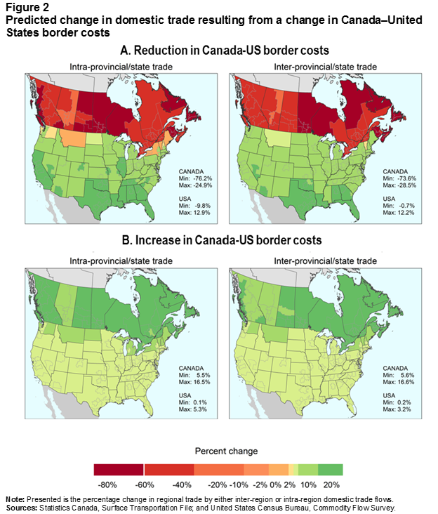
Description for Figure 2
The title of Figure 2 is “Predicted change in domestic trade resulting from a change in Canada–United States border costs.”
Figure 2 has two panels, A and B, each featuring two copies of the same map of Canadian provinces (the territories are not included) and the continental United States. The inter-provincial, intra-provincial, inter-state and intra-state borders are depicted in the maps. Below the two panels is a horizontal colour bar, titled “Percent change.” The percentages appearing under the colour bar are as follows, from left to right: 80%, 60%, 40%, 20%, 10%, 2%, 0%, 2%, 10%, and 20%. There are nine colours in the colour bar. It starts at the left with five shades (from dark red to light orange), followed by yellow, light green, medium green and dark green.
The title of panel A is “A. Reduction in Canada-US border costs.” The title of the left map in panel A is “Intra-provincial/state trade.” The title of the right map in Panel A is “Inter-provincial/state trade.”
The left map in panel A depicts the percentage impact of a reduction in Canada–United States border costs on intra-provincial and intra-state trade. The colours run from dark red to dark green, with shades of red representing negative values and green representing positive values. For intra-provincial trade, Canadian regions are shades of red, represented values of between 76.2% to 24.9%, as shown in the legend of the map. The darkest shades of red are along of the coast and the southwest of British Columbia, Saskatchewan (except for the region around Saskatoon), Manitoba, western Ontario, and Atlantic Canada. The rest of Canada is lighter, with the lightest regions in central Alberta. The regions in the United States are mostly green, except for the western and northeastern states along the Canada–United States border, which are light orange. Most of the states are light green, except for regions in the south: California and parts of neighbouring states, and from Texas to Florida, as well as the states north of them. The colours represent values from -9.8% to 12.9%, as shown in the legend of the map under the values for Canada.
The right map in panel A denotes the percentage impact of a reduction on inter-provincial and inter-state trade. The Canadian regions are mostly the second darkest shade of red, with the exception of Manitoba, western Ontario, northern Quebec and Atlantic Canada, which are dark red. The colours represent values from a minimum of -73.6% to -28.5%, as shown in the legend of the map. The U.S. states are mostly light green, except for the southeast from Texas to Florida which are darker green; and Vermont, which is pale orange. The colours represent values from 0.7% to 12.2%, as shown in the legend of the map, under the values for Canada.
The tile of panel B is “B. Increase in Canada-US border costs.”
The title of the left map in panel B is “Intra-provincial/state trade.” The title of the right map in panel B is “Inter-provincial/state trade.”
The left map in panel B represents changes in the intra-provincial and intra-state trade, and the right map, changes in inter-provincial/state trade, after Canada–United States border costs increase. Both maps are entirely in shades of green.
In the left map of panel B, almost all of Canada is the darkest green, with the notable exception of Alberta, which is a shade lighter. The colours represent values from a minimum of 5.5% to a maximum of 16.5%, as shown in the legend of the map. Most of the U.S. states are the lightest green. The states adjacent to the border are the same shade of darker green as Alberta, apart from Minnesota, Wisconsin and a sliver of central Washington that are also light green. The colours in the United States correspond to a minimum and maximum 0.1% and 5.3%, respectively, as shown in the legend of the map under the values for Canada.
In the right map of panel B, Canada is dark green, except for the interior of British Columbia, Alberta and the area around Saskatoon in Saskatchewan, which are lighter green. The colours represent values from a minimum of 5.6% to a maximum of 16.6%, as shown in the legend of the map. In the United States, most of Washington, Montana and the Northeastern states are darker green. The remainder of U.S. regions are light green. The colours represent values from a minimum of 0.2% to a maximum of 3.2%, as shown in the legend of the map below the values for Canada.
The note and sources are as follows:
Note: Presented is the percentage change in regional trade by either inter-region or intra-region domestic trade flows.
Sources: Statistics Canada, Surface Transportation file; and United States Census Bureau, Commodity Flow Survey.
For additional information, please contact Statistics Canada at STATCAN.infostats-infostats.STATCAN@canada.ca.
The regional consequences for expenditures are presented in Figure 3. The uneven impacts are most visible in the United States, where the low aggregate figure for reduced border costs obscures a pronounced north–south divide (panel A). Regions in the northeastern corner of the United States, including Montana, experience gains up to 10 times higher than regions in the south. Regions in the states bordering Canada and the Midwest states adjacent to them also experience gains that are higher than the national average. There is also substate variation. For example, New York State would gain 1.9% in overall expenditure because of increasing access to the Canadian market. However, the Buffalo region gains 3.8%, twice the statewide number, with Rochester and the rest of upstate New York also gaining over 3%.
For the second scenario (increased Canada–United States border costs, panel B), the consequences for Canada’s border regions are much larger than for their American counterparts, with expenditures falling between 1.5% and 3.5%. The centre of the country appears to be most affected: an arc from Manitoba around the Great Lakes and down to the tip of southwestern Ontario shows the greatest relative gains and losses when border costs change.
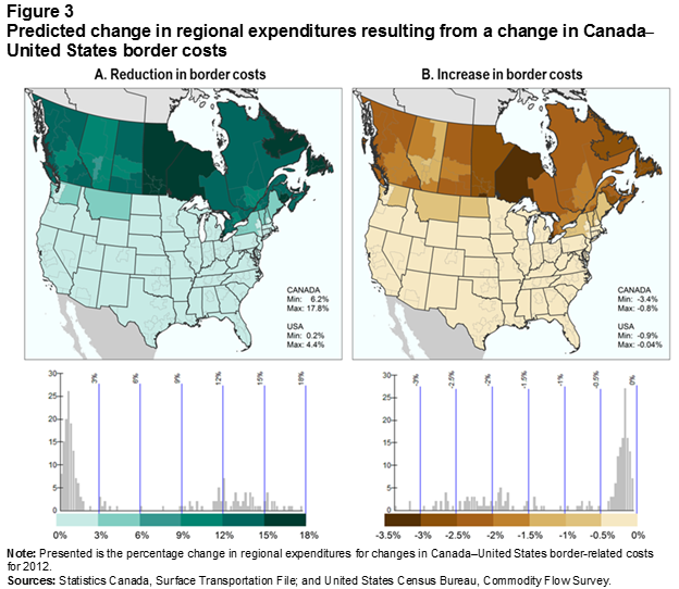
Description for Figure 3
The title of Figure 3 is “Predicted change in regional expenditures resulting from a change in Canada–United States border costs.”
Figure 3 has two side-by-side panels, A and B. Both panels feature the same map of Canadian provinces (the territories are not included) and the continental United States. The inter-provincial, intra-provincial, inter-state and intra-state borders are depicted in the maps. The maps show changes in regional expenditures. Below each map is a bar chart and associated horizontal colour bar located under and along the x-axis of the bar chart. The colour bars contains shades of colour. At every change in shade there is a vertical line that starts at the top of the colour bar and extends over the bar chart.
The title of panel A is “A. Reduction in border costs.”
The map in panel A depicts the impact on expenditures of a reduction in border costs. For Canada, the minimum predicted change in regional expenditures to the reduction in border costs is 6.2% and the maximum is 17.8%, as shown in the legend of the map. The corresponding minimum and maximum predicted changes for the United States are 0.2% and 4.4%, respectively. These are shown in the map legend below the percentages for Canada. The significance of the colours shown in the map is given by the bar chart and associated colour bar.
The graduation of the y-axis in the bar chart associated with the map begins at 0 and ends at 30, with tick marks at every 5 units. The x-axis has no graduation. It only shows the 0 mark at which it begins. The graduation used for the x-axis is the graduation of the colour bar, which consists of shades of green. The graduation starts at 0% (at the beginning of the lightest shade) and ends at 18% (at the end of the darkest shade), with changes in colour at every 3 units. There are six shades of green in the colour bar. In the bar chart, the bars with the highest values (one bar has a value of more than 25) are clustered close to the beginning of the x-axis.
The colours in the map of panel A run from light blue-green to dark green, light blue-green depicting gains of less than 3% and dark green depicting increases of over 15%. The United States is the lightest blue-green (gains of less than 3%), except for most of Washington, Montana and the border states in the northeast, which are a shade darker (gains between 3% and 6%). In Canada, Manitoba, northwestern Ontario and Newfoundland and Labrador are the darkest green (gains between 15% and 18%), Quebec and eastern Ontario (except for the border regions), Saskatchewan outside of Saskatoon, and British Columbia (except for the southwestern interior) are a shade lighter (gains between 12% and 15%). The other regions are green, denoting increases of between 9% and 12%.
The title of panel B is “B. Increase in border costs.”
The map in panel B depicts how overall expenditure decreases when the Canada–United States border costs increase. The map legend shows the minimum predicted change of -3.4% and maximum predicted change of -0.8% for Canada. The corresponding minimum and maximum values for the United States are -0.9% and -0.04%, respectively. These appear in the legend below the values for Canada. The significance of the colours shown in the map is given by the bar chart and associated colour bar.
The graduation of the y-axis in the bar chart associated with the map begins at 0 and ends at 30, with tick marks at every 5 units. The x-axis shows the 0 mark at which it begins. The graduation used for the x-axis is the graduation of the colour bar, which consists of shades of brown. The colour bar and its graduation start before the x-axis but ends at the same place as the x-axis. The graduation starts at -3.5% (at the beginning of the darkest shade) and ends at 0% (at the end of the lightest shade). There are seven shades of brown in the colour bar. In the bar chart, the bars with the highest values (one bar has a value of close to 30) are located between the -0.5% and 0% units in the colour bar.
The colours in the map of panel B run from dark brown for expenditure decreases of more than 3% to beige for declines of 0.5% to 0%. The United States is beige, except for the border states in the west and northeast, which are tan (declines between 1% and 0.5%). Canada's regions are varying shades of brown. The darkest brown is in northwestern Ontario (declines between 3.5% and 3%), followed by Atlantic Canada and Manitoba, which are a shade lighter (declines between 3% and 2.5%). British Columbia outside the southern interior and Saskatchewan outside of Regina, eastern Ontario and northern Quebec are lighter still (declines between 2.5% and 2%). The regions with the lightest browns are the British Columbia interior, Regina and the border regions of Ontario and Quebec (declines between 2% and 1.5%). Central Alberta is mostly tan like Montana (declines between 1.5% and 1%).
The note and sources for Figure 1 are as follows:
Note: Presented is the percentage change in regional expenditures for changes in Canada–United States border-related costs for 2012.
Sources: Statistics Canada, Surface Transportation file; and United States Census Bureau, Commodity Flow Survey.
For additional information, please contact Statistics Canada at STATCAN.infostats-infostats.STATCAN@canada.ca.
Conclusion
Canada and the United States share one of the most important trading relationships in the world. The uncertainty generated by the 2018 renegotiation of the North American Free Trade Agreement has highlighted the need to understand how a changing Canada–United States border affects firms and consumers within the two countries. This article uses the Surface Transportation File (Canada) and the 2012 Commodity Flow Survey (United States) to indirectly quantify the cost of the border and map its regional implications.
The estimated total impact of the border on trade in 2012 was consistent with previous work, showing that Canada–United States border costs far exceed average tariffs and quotas, and thereby indicating that non-tariff barriers are the leading sources of trade frictions. Using these border costs as a benchmark, the region-specific impacts of the border are illustrated by exploring a pair of counterfactual changes to border costs.
In the first scenario, the cost of trade between Canada and the United States is reduced to that of inter-provincial trade in Canada, which substantially affects cross-border trade for both countries. As a result, the value of intra-provincial and inter-provincial trade declines by about half in Canada as regions reorient their trade to the U.S. market. In the west, this decline comes more from intra-provincial flows. The eastern provinces are more likely to switch from inter-provincial trade to international trade.
Increasing border costs are associated with approximate declines of 23% in Canadian exports and 18% in U.S. exports. These falls reduce total expenditures by CAN$10 billion in Canada and by CAN$7 billion in the United States. While U.S. losses are collectively small, they are felt more keenly across the northern states. Regions within states found along the Canada–United States border are affected the most. National averages obscure substantial regional variation resulting from changing trade costs. The data, estimation and resulting maps detail which regions face the largest adjustments to North American trade flows (e.g., western Canada and eastern United States), and which regions stand to gain or lose from changing trade barriers.Note
References
Anderson, J.E., and E. van Wincoop. 2003. “Gravity with gravitas: A solution to the border puzzle.” American Economic Review 93 (1): 170–192.
Bemrose, R.K., W.M. Brown, and J. Tweedle. 2017. Going the Distance: Estimating the Effect of Provincial Borders on Trade When Geography Matters. Analytical Studies Branch Research Paper Series, no. 394. Statistics Canada Catalogue no. 11F0019M. Ottawa: Statistics Canada.
Brown, M., A. Dar-Brodeur, and J. Dixon. Estimating the Effect of Changing Canada-US Border Costs on North American Trade Patterns and Expenditures. Analytical Studies Branch Methods and Reference Series. Ottawa: Statistics Canada. Forthcoming.
Handley, K., and N. Limão. 2015. “Trade and investment under policy uncertainty: Theory and firm evidence.” American Economic Journal: Economic Policy 7 (4): 189–222.
Handley, K., and N. Limão. 2017. “Policy uncertainty, trade, and welfare: Theory and evidence for China and the United States.” American Economic Review 107 (9): 2731–2783.
Novy, D. 2013. “Gravity redux: Measuring international trade costs with panel data.” Economic Inquiry 51 (1): 101–121.
- Date modified: