
EnviroStats
Urban greenness, 2001, 2011 and 2019
by Nicholas Lantz, Marcelle Grenier and Jennie Wang
Skip to text
Text begins
Green spaces are essential to building the resilience and liveability of cities through the ecosystem goods and services they provide. For example, trees and other vegetation can improve urban air quality, mitigate urban heat island effects, reduce or delay storm water runoff, provide wildlife habitat and provide recreational opportunities and aesthetic benefits.Note
Urban greenness reflects the presence and health of vegetation in urban areas and is a measure of urban ecosystem condition. This study uses data from satellite imagery to track greenness across cities at three points in time. These data broadly represent vegetation across the whole of the city, reflecting parks and other publicly and privately owned green spaces and features. The level of urban greenness will depend on natural environmental conditions, for example climate, as well as differences in local land use.Note
Urbanization processes such as densification and urban expansion can result in significant reductions in the quantity and quality of ‘green' areas and related increases in ‘grey’ areas that consist of buildings, impervious surfaces, bare soil and low density vegetation. Long-term and temporary changes in greenness can be linked to these urbanization processes, as well as the addition or maturing of urban vegetation and changes in vegetation condition related to natural factors such as drought, insects or disease.
Start of text boxNote to readers
This analysis provides a synoptic view of urban greenness in Canada for three reference years over an 18-year period as a measure of urban condition. For more information on ecosystem accounts, see Canadian System of Environmental-Economic Accounting – Ecosystem Accounts. This assessment provides a consistent approach for measuring urban greenness across the country, which can be used to help measure progress towards the United Nations Sustainable Development Goal 11 target 11.7 “By 2030, provide universal access to safe, inclusive and accessible, green and public spaces.”Note Monitoring greenness over time can help inform decision making on greening policies.
This analysis used the normalized difference vegetation index (NDVI) generated from moderate resolution imaging spectroradiometer (MODIS)Note to estimate average urban greenness for 996 of 1,010 population centres (i.e., those located south of 60° latitude) in summer.Note In short, NDVI was used to measure the overall greenness of cities and towns in Canada.
NDVI captured by remote sensors is an indicator of vegetation presence and quantity—it provides a relative measure of photosynthetic activity. The results of NDVI calculation range from -1 to +1 and these values vary depending on the type of satellite images, season, study area, atmospheric effects, soil type, humidity, etc. Generally, high NDVI values correspond to healthier vegetation while low NDVI values indicate less or no vegetation. NDVI values close to +1 should represent dense green leaves, whereas very low values (0.1 and below) correspond to barren rock, sand, snow, water or impervious surfaces (e.g., roads and buildings).
The urban green class defined in this analysis corresponds to areas with an NDVI greater than or equal to 0.5, representing areas that are predominantly vegetated (Figure 1). Areas with lower values are considered ‘grey’ and are largely non-vegetated, though patches of grass, shrubs or crops, or other unhealthy/poor condition vegetation will be included. The selection of the 0.5 cut-off for identifying green and grey areas was determined after analysis of more than 50 sites using high resolution imagery available in Google Earth Pro and ESRI imagery basemaps and the application of the NDVI trends and vegetation change tools available in Google Earth Engine. The greenness layers and changes were also compared visually to the urban greenness score assigned by Czekajlo et al. for 10 sites.Note The areas showing decrease of greenness were similar on both products. Water areas were excluded from the analysis.
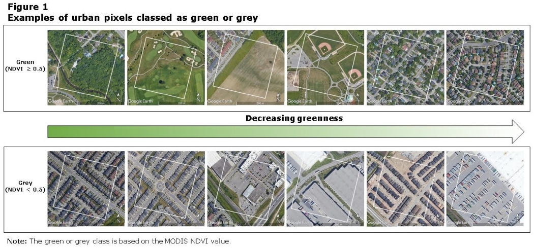
Description of Figure 1
The title of this image is “Examples of urban pixels classed as green or grey.” The purpose of this image is to visually display the levels of greenness between varying land covers. The green or grey class is based on the MODIS NDVI value.
The MODIS pixels are represented by a box with a white outline and are overlaid on high resolution imagery provided by Google to visualize what is present on the ground. The image compares twelve MODIS pixels organized into two horizontal rows. The top row displays decreasing greenness levels in green pixels and the bottom row displays decreasing greenness levels in grey pixels. In between the two rows there is an arrow spanning across the page from left to right, shaded in a gradient of green to white to illustrate decreasing greenness.
The first six MODIS pixel images are classed as green because their MODIS NDVI value is greater than or equal to 0.5, with the greenest pixel on the left and the least green pixel on the right. The last six MODIS pixel images are classed as grey because their MODIS NDVI value is less than 0.5, with the least grey pixel on the left and the greyest pixel on the right. From left to the right, the first green pixel represents mostly treed area with a few buildings present and a stream and road passing through it, the second represents a golf course with mostly grass, the third represents an agricultural area with part of the pixel overlaid on residential area, the fourth represents a city park with a baseball diamond, grass, and a parking lot, the fifth represents a residential area with large lots and trees, and the sixth represents a residential area with smaller lots and some trees. From left to right, the first grey pixel represents a residential area with few trees and grass and mostly artificial surfaces, the second grey pixel represents a residential area with no trees, some grass and mostly artificial surfaces, the third pixel represents an area with some large buildings, mostly paved surfaces and some grass, the fourth pixel represents an area with mostly large buildings, paved surfaces and some grass, the fifth pixel represents a new residential development with individual houses, paved surfaces, bare ground and no vegetation, and the sixth pixel represents an entirely paved surface.
Greenness was assessed for nine weeks from June 25 to August 26 for the reference years 2001, 2011 and 2019 for the same physical area using the 2016 population centre boundary to ensure consistency. This geography was developed by Statistics Canada in 2011 to replace the ‘urban area’ geography and delineation rules were revised for the 2016 Census. Consequently, in this study, the 2001 and 2011 assessments may capture peri-urban areas that were subsequently developed, while 2019 may exclude urban expansion that occurred post 2016. Using the 2016 boundary may therefore bias results towards a higher proportion of green area in 2001 and 2011 and less in 2019.
The MODIS data used in this study has a spatial resolution of 230 m, which corresponds to an area of 0.05 km2 (i.e., a 52,900 m2 footprint) and the resolution of the pixel (230 m x 230 m) is a limitation of this data set. However, MODIS vegetation indices have demonstrated the capacity to identify spatial and temporal patterns of human growth in urban areas.Note MODIS NDVI is often used in epidemiological investigations of greenness and health, Note and some benefits include its higher temporal resolution compared to the higher spatial resolution sensors, such as Landsat. Similar results have been obtained from MODIS and Landsat NDVI, demonstrating the validity of the MODIS dataset in greenness-health studies.Note As well, use of MODIS data makes it feasible to collect and process at the continental level.
This assessment of greenness has several limitations associated with the use of NDVI to represent greenness, including the coarse resolution of the MODIS data and the selection of the 0.5 NDVI cut-off as a threshold to classify green or grey pixels. As well, no distinction was made between greenness resulting from publicly accessible parks and private inaccessible spaces. For trend analysis, assessment of additional time series data is required, while higher resolution data is needed for the identification of detailed urban green spaces. A next step for this work will be the assessment of green space extent and greenness condition using more spatially-detailed datasets and additional time periods.
Greenness lowest in large urban population centres
In 2019, 76% of the area in 996 population centres in southern Canada could be classed as green (Table 1). This percentage varied based on city size and regional differences.
In large urban population centres, an average of 70% of the total land area was classed as green, with the share ranging from 38% in Winnipeg to 94% in Kanata (Chart 1). These values reflect peak summer greenness and can vary greatly depending on local climate conditions. A comparison of the top five large urban population centres shows that 65% of Toronto, 70% of Montreal, 68% of Vancouver, 42% of Calgary and 60% of Edmonton were classed as green in 2019 (Figure 2).
Average urban greenness was 78% for medium population centres and 87% in small population centres. In over one-third (35%) of small population centres the entire area was classed as green. Population centres across the Prairies had the lowest greenness on average. Greenness was highest in the Atlantic provinces.
| Population centres | Average urban greenness | Type of urban greenness change | ||||||||
|---|---|---|---|---|---|---|---|---|---|---|
| 2001 | 2011 | 2019 | 2001 to 2011 | 2001 to 2019 | ||||||
| Decrease | Stable | Increase | Decrease | Stable | Increase | |||||
| number | percentage of area | percentage of population centres | ||||||||
| Total population centres | 996 | 80.3 | 80.3 | 75.7 | 27.0 | 35.2 | 37.8 | 38.8 | 30.1 | 31.1 |
| Size classes | ||||||||||
| Large urban | 31 | 75.8 | 75.4 | 69.6 | 29.0 | 16.1 | 54.8 | 77.4 | 0.0 | 22.6 |
| Medium | 58 | 82.0 | 81.6 | 77.7 | 46.6 | 12.1 | 41.4 | 70.7 | 8.6 | 20.7 |
| Small | 907 | 88.3 | 89.1 | 87.0 | 25.7 | 37.4 | 36.9 | 35.4 | 32.5 | 32.1 |
| Regions | ||||||||||
| Atlantic | 101 | 94.3 | 95.6 | 93.9 | 6.9 | 55.4 | 37.6 | 20.8 | 50.5 | 28.7 |
| Québec | 268 | 86.0 | 87.2 | 82.8 | 13.1 | 51.1 | 35.8 | 30.6 | 43.7 | 25.7 |
| Ontario | 286 | 81.8 | 81.4 | 78.7 | 26.6 | 37.1 | 36.4 | 38.1 | 33.6 | 28.3 |
| Prairies | 234 | 61.5 | 62.6 | 55.5 | 41.9 | 9.8 | 48.3 | 43.6 | 8.1 | 48.3 |
| British Columbia | 107 | 84.0 | 80.6 | 72.9 | 49.5 | 27.1 | 23.4 | 67.3 | 15.9 | 16.8 |
|
Notes: Estimates of population centre greenness are based on the Normalized Difference Vegetation Index (NDVI) from MODIS. Water areas have been excluded. Includes population centres south of 60° latitude based on the 2016 population centre boundaries for all years to ensure consistency. Change in greenness compares the point in time to 2001 and does not represent a trend over time. Source: Statistics Canada, Environment and Energy Statistics Division, special tabulation from Statistics Canada, 2020, Corrected representation of the NDVI using historical MODIS satellite images (250 m resolution) from 2000 to 2019, https://open.canada.ca/data/en/dataset/dc700f75-19d8-4913-9846-78615ca93784 (accessed April 29, 2020). |
||||||||||
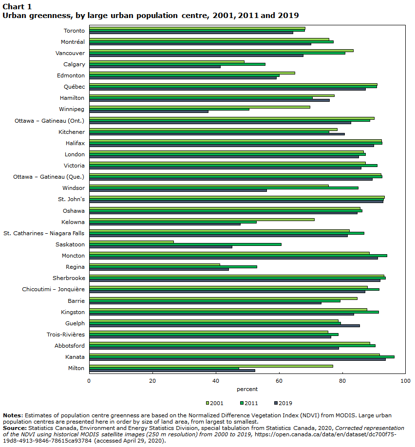
Data table for Chart 1
| 2001 | 2011 | 2019 | |
|---|---|---|---|
| percent | |||
| Toronto | 69 | 68 | 65 |
| Montréal | 76 | 78 | 70 |
| Vancouver | 84 | 81 | 68 |
| Calgary | 49 | 56 | 42 |
| Edmonton | 65 | 60 | 60 |
| Québec | 91 | 91 | 88 |
| Hamilton | 78 | 71 | 76 |
| Winnipeg | 70 | 51 | 38 |
| Ottawa – Gatineau (Ont.) | 91 | 89 | 83 |
| Kitchener | 79 | 76 | 81 |
| Halifax | 93 | 93 | 90 |
| London | 87 | 88 | 86 |
| Victoria | 88 | 91 | 86 |
| Ottawa – Gatineau (Que.) | 93 | 93 | 90 |
| Windsor | 76 | 85 | 56 |
| St. John's | 94 | 93 | 93 |
| Oshawa | 86 | 87 | 85 |
| Kelowna | 72 | 53 | 48 |
| St. Catharines – Niagara Falls | 83 | 87 | 82 |
| Saskatoon | 27 | 61 | 46 |
| Moncton | 89 | 95 | 92 |
| Regina | 42 | 53 | 44 |
| Sherbrooke | 94 | 94 | 92 |
| Chicoutimi – Jonquière | 88 | 92 | 87 |
| Barrie | 85 | 80 | 74 |
| Kingston | 88 | 92 | 84 |
| Guelph | 79 | 80 | 86 |
| Trois-Rivières | 76 | 79 | 77 |
| Abbotsford | 89 | 91 | 79 |
| Kanata | 92 | 97 | 94 |
| Milton | 77 | 48 | 53 |
|
Notes: Estimates of population centre greenness are based on the Normalized Difference Vegetation Index (NDVI) from MODIS. Large urban population centres are presented here in order by size of land area, from largest to smallest. Source: Statistics Canada, Environment and Energy Statistics Division, special tabulation from Statistics Canada, 2020, Corrected representation of the NDVI using historical MODIS satellite images (250 m resolution) from 2000 to 2019, https://open.canada.ca/data/en/dataset/dc700f75-19d8-4913-9846-78615ca93784 (accessed April 29, 2020). |
|||
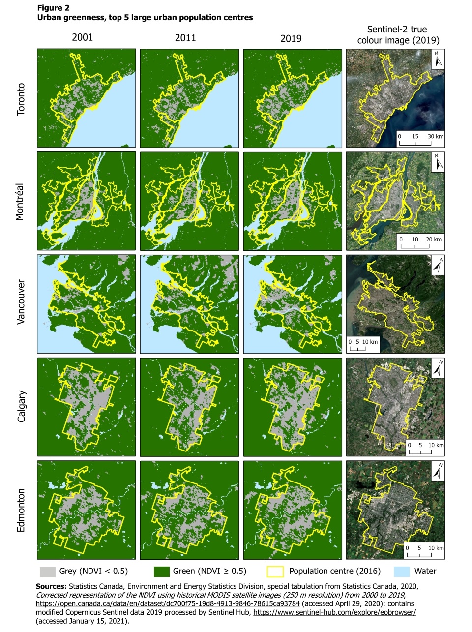
Description of Figure 2
The title of this figure is “Urban Greenness, top 5 large urban population centres.” It provides a visual representation of urban greenness for three years (2001, 2011 and 2019) in Toronto, Montreal, Vancouver, Calgary and Edmonton.
This figure includes a legend and 20 images. The legend contains four categories: Grey pixel = NDVI < 0.5, Green pixel = NDVI ≥ 0.5, Yellow border = population centre limits (2016), Blue pixel = Water.
Images are organized in five rows, one row per population centre, and four columns. The first row shows images for Toronto, the second row shows images for Montreal, the third shows images for Vancouver, the fourth shows images for Calgary, and the fifth shows images for Edmonton.
The first three columns organize images for 2001, 2011 and 2019. These images display pixels that are classified as green or grey based on the MODIS NDVI cutoff of 0.5. The final column displays a true colour image from Sentinel-2 from 2019, with a scale and compass arrow indicating north as reference information. A yellow line outlines the population centre on all images.
This figure shows the share of each population centre that was classified as green was lowest in 2019.
Sources: Statistics Canada, Environment and Energy Statistics Division, special tabulation from Statistics Canada, 2020, Corrected representation of the NDVI using historical MODIS satellite images (250 m resolution) from 2000 to 2019, https://open.canada.ca/data/en/dataset/dc700f75-19d8-4913-9846-78615ca93784 (accessed April 29, 2020); contains modified Copernicus Sentinel data 2019 processed by Sentinel Hub, https://www.sentinel-hub.com/explore/eobrowser/ (accessed January 15, 2021).
| Population centre | 2001 | 2011 | 2019 |
|---|---|---|---|
| percentage of area | |||
| Toronto | 69 | 68 | 65 |
| Montréal | 76 | 78 | 70 |
| Vancouver | 84 | 81 | 68 |
| Calgary | 49 | 56 | 42 |
| Edmonton | 65 | 60 | 60 |
2001 drought impacted greenness measures
In general, the proportion of green area in population centres in 2019 was lower than in 2001. Approximately three-quarters of large (77%) and medium (71%) population centres had lower levels of greenness over this period (Table 1). In comparison, 35% of small population centres experienced a drop in greenness while 33% saw no change in greenness levels.
Between 2001 and 2011, the overall proportion of urban greenness remained the same. This finding can be largely explained by widespread drought conditions in 2001 across the Canadian south-west and an abnormally dry summer in Ontario and Quebec in the same year.Note The 2001 drought had a significant impact on the condition of urban forests,Note resulting in a lower proportion of green area in that year. In contrast, weather conditions during the growing season were more normal in 2011. Note
An increase in greenness from 2001 to 2011 was observed for approximately half of large urban (55%) and medium (41%) population centres. A decrease was observed for 29% of large urban centres and 47% of medium population centres, which indicates that urbanization processes in these areas were likely significant enough to overcome the effect of weather conditions and contribute to the variation in the greenness measure. In 2011, urban greenness was stable or increased in the majority (74%) of small population centres relative to 2001.
Urbanization processes linked to population change a factor
Drought conditions monitoring indicates that the south of Canada experienced abnormally dry conditions to moderate drought in 2019.Note While these conditions may have contributed to lower levels of greenness, they were less severe than those experienced in 2001, which suggests that in general the drop in urban greenness from 2001 to 2019 may be explained by urbanization processes.
Winnipeg, Milton, Kelowna, Windsor and Vancouver experienced some of the largest decreases in the share of green extent in 2019 compared to 2001 (Chart 2). These larger decreases in greenness are likely driven partly by the contributions of urbanization and the 2019 drought. For example, in Milton, the drop in greenness over the period coincided with a population increase of 350% from 2001 to 2016 (Figure 3 and Table 2). However, it is important to note that decreases in Winnipeg and Windsor may have been amplified by the effect of the emerald ash borer—an insect that has had a large impact on trees in some regions of the country.Note
| Population | Land area | Population change | ||||
|---|---|---|---|---|---|---|
| 2001 | 2011 | 2016 | 2001 to 2011 | 2011 to 2016 | ||
| number | km2 | percentage | ||||
| Total population centres | 23,399,918 | 26,917,492 | 28,508,127 | 16,733 | 15.0 | 5.9 |
| Large urban population centres | 17,110,433 | 19,728,652 | 20,938,295 | 9,487 | 15.3 | 6.1 |
| Medium population centres | 2,616,812 | 3,013,299 | 3,179,294 | 2,454 | 15.2 | 5.5 |
| Small population centres | 3,672,672 | 4,175,541 | 4,390,538 | 4,792 | 13.7 | 5.1 |
| Large urban population centres with the largest decreases in the share of population centre greenness from 2001 to 2019 | ||||||
| Winnipeg | 623,649 | 670,025 | 711,925 | 344 | 7.4 | 6.3 |
| Milton | 22,574 | 75,880 | 101,715 | 40 | 236.1 | 34.0 |
| Kelowna | 113,302 | 140,131 | 151,957 | 136 | 23.7 | 8.4 |
| Windsor | 265,926 | 277,970 | 287,069 | 176 | 4.5 | 3.3 |
| Vancouver | 1,807,734 | 2,124,443 | 2,264,823 | 876 | 17.5 | 6.6 |
| Barrie | 108,413 | 140,383 | 145,614 | 84 | 29.5 | 3.7 |
| Abbotsford | 100,250 | 115,011 | 121,279 | 69 | 14.7 | 5.4 |
| Calgary | 875,929 | 1,094,379 | 1,237,656 | 586 | 24.9 | 13.1 |
| Ottawa-Gatineau (Ont.) | 636,432 | 701,418 | 735,675 | 341 | 10.2 | 4.9 |
| Edmonton | 761,867 | 935,361 | 1,062,643 | 573 | 22.8 | 13.6 |
|
Notes: Includes population centres south of 60° latitude. Population data have been aggregated to the 2016 population centre boundaries for all years to ensure consistency. Water areas have been excluded. Source: Statistics Canada, Environment and Energy Statistics Division, special tabulation based on the Census of Population. |
||||||
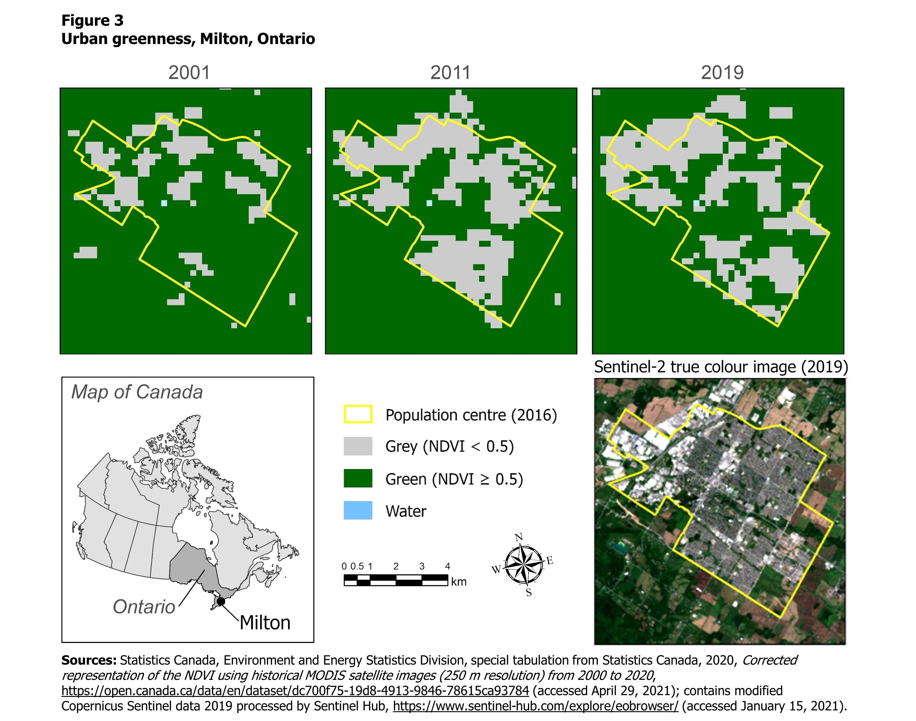
Description of Figure 3
The title of this figure is “Urban Greenness, Milton, Ontario.” This figure provides a visual representation of urban greenness for three years (2001, 2011 and 2019) in Milton, Ontario.
This figure includes a legend and five images. The legend contains four categories: Yellow border = population centre limits (2016), Grey pixel = NDVI <0.5, Green pixel = NDVI ≥0.5, Blue pixel = Water.
The top row organizes images for 2001, 2011 and 2019. These images display pixels that are classified as green or grey based on the MODIS NDVI cutoff of 0.5. A yellow line outlines the population centre.
The second row includes reference info including a map of Canada indicating the location of Milton, Ontario on the left and a true colour image from Sentinel-2 from 2019 on the right. Between these images there is a legend, a scale and a compass.
This figure shows a large increase in areas classified as grey in 2011 and 2019, compared to the 2001.
Sources: Statistics Canada, Environment and Energy Statistics Division, special tabulation from Statistics Canada, 2020, Corrected representation of the NDVI using historical MODIS satellite images (250 m resolution) from 2000 to 2019, https://open.canada.ca/data/en/dataset/dc700f75-19d8-4913-9846-78615ca93784 (accessed April 29, 2020); contains modified Copernicus Sentinel data 2019 processed by Sentinel Hub, https://www.sentinel-hub.com/explore/eobrowser/ (accessed January 15, 2021).
| 2001 | 2011 | 2019 | |
|---|---|---|---|
| percentage of area | |||
| Milton | 77 | 48 | 53 |
- Date modified: