Infographic 4
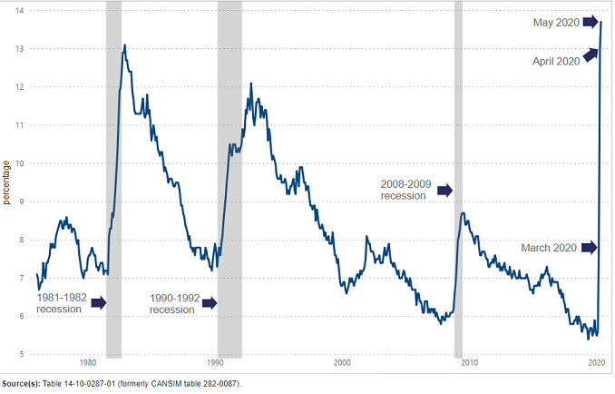
Unemployment rate at record high

Infographic description
The title of the infographic is "Unemployment rate at record high"
This is a linear chart.
The vertical axis shows percentages from 5 to 14 by single increments.
The horizontal axis shows every month from January 1976 to May 2020, by increments of 10 years.
There are three vertical bars in the chart, showing the 1981-1982 recession, the 1990-1992 recession and the 2008-2009 recession.
The chart shows an increase in the unemployment rate from 13.0% in April 2020 to 13.7% in May 2020.
Source(s): Table 14-10-0287-01 (formerly CANSIM table 282-0087).
- Date modified: