Common menu bar links
Cumulative percentage
Archived Content
Information identified as archived is provided for reference, research or recordkeeping purposes. It is not subject to the Government of Canada Web Standards and has not been altered or updated since it was archived. Please contact us to request a format other than those available.
Cumulative percentage is another way of expressing frequency distribution. It calculates the percentage of the cumulative frequency within each interval, much as relative frequency distribution calculates the percentage of frequency.
The main advantage of cumulative percentage over cumulative frequency as a measure of frequency distribution is that it provides an easier way to compare different sets of data.
Cumulative frequency and cumulative percentage graphs are exactly the same, with the exception of the vertical axis scale. In fact, it is possible to have the two vertical axes, (one for cumulative frequency and another for cumulative percentage), on the same graph.
Cumulative percentage is calculated by dividing the cumulative frequency by the total number of observations (n), then multiplying it by 100 (the last value will always be equal to 100%). Thus,
cumulative percentage = (cumulative frequency ÷ n) x 100
Example 1 – Calculating cumulative percentage
For 25 days, the snow depth at Whistler Mountain, B.C. was measured (to the nearest centimetre) and recorded as follows:
242, 228, 217, 209, 253, 239, 266, 242, 251, 240, 223, 219, 246, 260, 258, 225, 234, 230, 249, 245, 254, 243, 235, 231, 257.
- Use the data above (the same data as in Example 2 of the previous section on Cumulative Frequency) to:
- construct another frequency distribution table
- figure out what the frequency is for each interval
- find out the endpoint for each interval
- calculate the cumulative frequency and percentage
- record results in the table
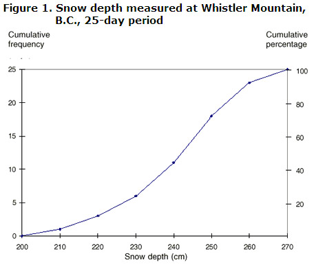
- Draw a graph with two different vertical (y) axes (either on each side of the graph, or side by side): one for cumulative frequency and one for cumulative percentage. Be sure to label cumulative frequency and cumulative percentage on either side of the vertical or y-axis. Label the x-axis with the other variable (snow depth).
Answers:
- The snow depth measurements range from 209 cm to 266 cm. In order to produce the table, the data are best grouped in class intervals of 10 cm each.
In the Snow depth column, each 10-cm class interval from 200 cm to 270 cm is listed.
The Frequency column records the number of observations that fall within a particular interval. This column represents the observations in the Tally column, only in numerical form.
Each of the numbers in the Endpoint column is the highest number in each class interval. In the interval of 200 cm to 210 cm, the endpoint would be 210.
The Cumulative frequency column lists the total of each frequency added to its predecessor, as seen in the exercises in the previous section.
The Cumulative percentage column divides the cumulative frequency by the total number of observations (in this case, 25). The result is then multiplied by 100. This calculation gives the cumulative percentage for each interval.
Table 1. Snow depth measured at Whistler Mountain, B.C., 25-day period Snow depth (x) Tally Frequency (f) Endpoint Cumulative frequency Cumulative percentage 200 0 0 ÷ 25 x 100 = 0 200 to < 210 
1 210 1 1 ÷ 25 x 100 = 4 210 to < 220 
2 220 3 3 ÷ 25 x 100 = 12 220 to < 230 
3 230 6 6 ÷ 25 x 100 = 24 230 to < 240 
5 240 11 11 ÷ 25 x 100 = 44 240 to < 250 
7 250 18 18 ÷ 25 x 100 = 72 250 to < 260 
5 260 23 23 ÷ 25 x 100 = 92 260 to < 270 
2 270 25 25 ÷ 25 x 100 = 100 - Apart from the extra axis representing the cumulative percentage, the graph should look exactly the same as that drawn in Example 2 of the section on Cumulative frequency.
The Cumulative percentage axis is divided into five intervals of 20, while the Cumulative frequency axis is divided into five intervals of 5. The Snow depth axis is divided by the endpoints of each 10-cm class interval.
Using each endpoint to plot the graph, you will discover that both the cumulative frequency and the cumulative percentage land in the same spot. For example, using the endpoint of 260, plot your point on the 23rd day (cumulative frequency). This point happens to be in the same place where the cumulative percentage (92%) will be plotted.
You have to be very careful when you are building a graph with two y-axes. For example, if you have 47 observations, you might be tempted to use intervals of 5 and end your y-axis at the cumulative frequency of 50. However, when you draw your y-axis for the cumulative percentage, you must put the 100% interval at the same level as the 47 mark on the other y-axis—not at the 50 mark. For this example, a cumulative frequency of 47 represents 100% of your data. If you put the 100% at the top of the scale where the 50 interval is marked, your line for the cumulative frequency will not match the line for the cumulative percentage.
The plotted points join to form an ogive, which often looks similar to a stretched S. Ogives are used to determine the number, or percentage, of observations that lie above or below a specified value. For example, according to the table and the graph, 92% of the time the snow depth recorded in the 25-day period was below the 260 cm mark.

The following information can be gained from either the graph or table:
- during the 25-day period, 24% of the time the recorded snow depth was less than 230 cm
- on 7 of the 25 days, snow depth was at least 250 cm
